Get ready to unleash your creativity with “Color Craftsmanship: Unlocking the Secrets to Mastering Harmonious Color in Your Crafts.” In this informative article, we will guide you through the art of color and reveal the secrets behind selecting harmonious color combinations for your crafts. Whether you are a beginner or an experienced crafter, you’ll gain valuable insights into color theory and discover techniques to bring your creations to life with stunning color palettes. Let’s embark on this colorful journey together and take your crafting skills to the next level!
Understanding Color Theory
The Basics of Color Theory
Color theory is a fundamental aspect of any artistic endeavor. It involves understanding how colors interact with one another and how they can be combined to create visually appealing compositions. By grasping the basics of color theory, you will have a solid foundation for selecting harmonious color combinations in your crafts.
Primary, Secondary, and Tertiary Colors
To fully comprehend color theory, it’s essential to know about the three main categories of colors: primary, secondary, and tertiary. Primary colors are the building blocks of all other colors and cannot be obtained by mixing other colors together. These primary colors are red, blue, and yellow. Secondary colors, on the other hand, are produced by blending two primary colors. The three secondary colors are green (mixed from blue and yellow), orange (mixed from red and yellow), and purple (mixed from red and blue). Tertiary colors are created by combining a primary color with a neighboring secondary color. These colors offer a wide range of shades and tones, providing even more possibilities for your crafts.
Warm and Cool Colors
Another crucial aspect of color theory is the distinction between warm and cool colors. Warm colors, such as red, yellow, and orange, evoke feelings of energy, passion, and happiness. They can create a sense of warmth and excitement in your crafts. On the other hand, cool colors, such as blue, green, and purple, exude calmness, tranquility, and serenity. These colors are often used to create a soothing and peaceful atmosphere in your artistic creations.
Color Harmonies
Analogous Color Scheme
Analogous color schemes involve using colors that are adjacent to each other on the color wheel. This color scheme creates a harmonious and cohesive look, as the colors share similarities and have a natural progression. For example, you might opt for a combination of various shades of blue and green for a serene and nature-inspired feel.
Complementary Color Scheme
When you choose colors that are directly opposite each other on the color wheel, you create a complementary color scheme. This scheme offers a striking contrast and can make your crafts visually captivating. For instance, pairing red with green or blue with orange can create a vibrant and energetic composition.
Triadic Color Scheme
A triadic color scheme involves selecting three colors that are evenly spaced around the color wheel. This combination offers a balanced and vibrant look, as the colors are equidistant from each other. For example, you could choose the primary colors red, blue, and yellow, or opt for a combination of purple, orange, and green. Using a triadic color scheme adds complexity and visual interest to your crafts.

The Psychology of Color
Color Symbolism
Colors have deep symbolism and can evoke specific emotions or associations. Understanding the symbolism behind colors can help you convey your intended message or mood through your crafts. For instance, using red can represent passion and energy, while blue may symbolize calmness and stability. Exploring color symbolism allows you to make deliberate choices and create a more impactful artistic piece.
Making Emotional Connections with Color
Colors have the ability to evoke emotional responses in viewers. By selecting colors that align with the emotions you want to evoke, you can create a stronger connection between your crafts and your audience. For example, if you want to induce a feeling of nostalgia or warmth, using warm colors such as yellow or orange can help achieve that emotional connection.
Color Associations
Different colors are often associated with certain concepts or ideas. For instance, green is commonly associated with nature and growth, while black represents power and elegance. Understanding these associations can help you choose the right colors for specific themes or subjects in your crafts. By deliberately selecting colors with appropriate associations, you can enhance the overall meaning and impact of your artistic creations.
Color and Materials
Choosing the Right Colors for Different Materials
Not all colors will look the same on different materials. It’s important to consider the properties of the material you are working with when selecting your color palette. For example, colors may appear different on paper compared to fabric or wood. Additionally, some materials may absorb or reflect light differently, resulting in variations in color intensity. By taking these factors into account, you can ensure that your chosen colors will look their best on the specific material you are working with.
Considerations for Different Crafts
Different crafts require different color considerations. For instance, if you are working on a painting, you will need to consider the interaction of colors on the canvas and how they blend together. On the other hand, if you are creating jewelry, you may need to think about how the color of beads or gemstones complements the overall design. Each craft has its own unique aspects to consider, and understanding how color interacts with those aspects will help you achieve the desired aesthetic outcome.

Color Mixing Techniques
Blending Colors
Blending colors is a technique where two or more colors are combined to create a smooth transition between them. This technique is especially useful when you want to create gradient effects or achieve a seamless transition between different shades. Blending colors requires patience and skill, as it involves layering and overlapping colors until they seamlessly merge.
Creating Gradations
Gradations involve creating a gradual transition from one color to another. This technique is often used to add depth and dimension to your crafts. By carefully manipulating the intensity or value of a color, you can create a gentle transition from light to dark or vice versa. Gradations can be achieved through various techniques such as shading, stippling, or cross-hatching.
Color Washes and Glazes
Color washes and glazes are techniques that involve applying thin layers of transparent or semi-transparent colors over a base color. These techniques can add subtle shifts in hue or tone, creating a soft and delicate look. Color washes and glazes are particularly effective for adding depth and richness to paintings or adding a touch of color to pottery or ceramics.
Using Color Wheel Tools
Understanding the Color Wheel
The color wheel is a visual representation of the relationships between colors. It consists of primary, secondary, and tertiary colors, arranged in a circular format. Understanding the color wheel allows you to visualize color relationships and make informed decisions about color combinations. By using the color wheel as a reference, you can easily identify complementary, analogous, or triadic color schemes.
Using Color Schemes from Color Wheels
Color wheels provide ready-made color schemes that you can use as starting points for your crafts. These schemes ensure that the colors you choose work harmoniously together. By selecting a color scheme from the color wheel, you can save time and effort in finding the right combination of colors. Whether you prefer an analogous, complementary, or triadic color scheme, the color wheel serves as a valuable tool to guide your color choices.
Color Wheel Tools for Crafters
In addition to traditional color wheels, there are various color wheel tools specifically designed for crafters. These tools often come in the form of rotating discs or swatches that allow you to preview different color combinations. They take into account not only primary, secondary, and tertiary colors but also variations in tint, shade, and tone. Color wheel tools for crafters enable you to experiment with different color combinations effortlessly and ensure harmonious results in your crafts.

Color Palettes for Crafts
Exploring Different Color Palettes
Color palettes refer to the range of colors used in a particular project or craft. Exploring different color palettes offers endless possibilities for your artistic endeavors. You can choose from bold and vibrant palettes or soft and muted ones, depending on the mood or theme you want to convey. Experimenting with different color palettes allows you to unleash your creativity and discover new combinations that resonate with your artistic vision.
Monochromatic Color Palettes
A monochromatic color palette involves using variations of a single color. This approach can create a harmonious and sophisticated look. By using different shades and tones of a single color, you can add depth and interest to your crafts while maintaining visual unity. Monochromatic palettes are versatile and can be applied to various crafts, from painting to fiber arts.
Nature-Inspired Color Palettes
Nature provides a rich source of inspiration for color palettes. From breathtaking sunsets to vibrant floral displays, the natural world offers an endless array of color combinations. By observing and studying nature, you can create color palettes that capture the beauty and essence of the natural environment. Whether you choose earthy tones or vibrant hues, nature-inspired color palettes can infuse your crafts with a sense of harmony and beauty.
Color as a Design Element
Creating Balance with Color
Color has the power to create a sense of balance or imbalance in your crafts. By strategically using color, you can achieve visual equilibrium and create a harmonious composition. Understanding color harmony and balance will enable you to distribute colors effectively throughout your crafts, enhancing their overall aesthetic appeal. Balancing warm and cool colors, employing complementary color schemes, or using analogous colors can all contribute to achieving visual equilibrium.
Emphasizing and Subduing Color
Color can be used to draw attention to specific areas or elements in your crafts. By emphasizing certain colors, you can create focal points and direct the viewer’s gaze. On the other hand, by subduing or toning down certain colors, you can create a more subdued or balanced composition. Skillfully manipulating color allows you to guide the viewer’s eye and highlight the elements that are most important in your artistic piece.
Using Color to Enhance Form and Shape
Color can be used to enhance the perception of form and shape in your crafts. By strategically applying light and dark shades, you can create a three-dimensional effect and give the illusion of depth. Additionally, using contrasting colors can highlight the contours and edges of objects, further emphasizing their form. Color can add dimension and visual interest to your crafts, transforming flat surfaces into dynamic and engaging creations.

Overcoming Color Challenges
Dealing with Color Overload
Sometimes, working with a wide range of colors can be overwhelming. When faced with color overload, it’s important to take a step back and reassess your approach. Simplifying your color palette or focusing on a limited number of colors can help bring clarity and cohesiveness to your crafts. By carefully selecting a few key colors, you can create a more impactful and controlled color composition.
Creating Harmony in Vibrant Color Crafts
Working with vibrant colors can be exhilarating, but it also poses the risk of creating chaotic or overwhelming compositions. To maintain harmony in vibrant color crafts, consider using a neutral color as a grounding element. Neutrals such as gray, white, or beige can help balance and tone down the intensity of vibrant colors, allowing them to shine without overpowering the overall composition.
Making Color Corrections
Mistakes happen, and sometimes you may find that a color choice doesn’t work as well as you had anticipated. Making color corrections involves adjusting or altering the colors in your crafts to achieve the desired effect. This can be done through techniques such as layering additional colors, blending, or applying washes or glazes. Being open to making color corrections allows you to refine and improve your artistic piece until it reflects your original vision.
Tips and Tricks for Color Craftsmanship
Experimenting with Color
Don’t be afraid to experiment with color! The beauty of crafts lies in the freedom to explore and create. Take risks, try out unconventional color combinations, and push the boundaries of your creativity. By embracing experimentation, you may stumble upon unique and captivating color combinations that truly make your crafts stand out.
Exploring Unconventional Color Combinations
Sometimes, the most striking color combinations are the ones that break traditional rules. By venturing into unconventional color territory, you can create unexpected and intriguing visual compositions. Don’t be limited by preconceived notions of what colors should or shouldn’t go together. Instead, follow your intuition and let your artistic vision guide you towards unconventional color combinations that ignite your creativity.
Keeping a Color Journal
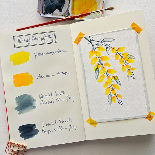
A color journal is a valuable tool for any crafter. This journal can be a physical notebook or a digital document where you record color combinations, notes, and inspirations. Keeping a color journal allows you to track your color experiments and keep a record of successful combinations for future reference. It also serves as a source of inspiration when you’re looking for new ideas or struggling with color choices. By maintaining a color journal, you can continue to refine your color craftsmanship and nurture your artistic growth.
In conclusion, understanding color theory is essential for any crafter aiming to create harmonious and visually captivating crafts. From the basics of primary, secondary, and tertiary colors to the exploration of color harmonies and the psychology of color, this comprehensive guide provides a wealth of knowledge to elevate your color craftsmanship. By applying these principles, experimenting with different color palettes, and utilizing various color mixing techniques, you can unlock the secrets of mastering harmonious color in your crafts. So go forth, armed with this newfound understanding of color, and create works of art that inspire and delight.


