In “Color Harmony for Crafting: A Comprehensive Guide,” you will embark on a journey to discover the secrets of creating visually stunning crafts. This guide, titled “Mastering the Art of Color: A Guide to Harmonious Crafting,” will take you through the fascinating world of color theory and teach you how to select the perfect color combinations for your various creative projects. Whether you’re a seasoned crafter looking to enhance your skills or a beginner eager to learn, this comprehensive guide is here to help you bring your creations to life with harmonious colors that captivate the eye.


Understanding Color Theory
Color theory is the foundation for achieving harmonious and visually appealing color combinations in any craft project. By understanding the principles and concepts of color theory, you can create color palettes that evoke specific moods, convey messages, and enhance the overall aesthetics of your creations.
The Color Wheel
At the core of color theory is the color wheel. The color wheel is a visual representation of the spectrum of colors, organized in a circular format. It consists of three primary colors – red, blue, and yellow – which cannot be created by mixing other colors.
Primary, Secondary, and Tertiary Colors
Primary colors are the foundation of all other colors. When you mix two primary colors together, you create secondary colors – orange, green, and purple. Tertiary colors are created by mixing a primary color with a neighboring secondary color on the color wheel.
Warm and Cool Colors
Colors can be categorized as either warm or cool. Warm colors, such as reds, oranges, and yellows, are associated with energy, passion, and vibrancy. Cool colors, such as blues, greens, and purples, evoke a sense of tranquility, calmness, and relaxation.
Value and Saturation
Value refers to the lightness or darkness of a color, while saturation pertains to the intensity or purity of a color. Understanding how to manipulate value and saturation can help you create depth, contrast, and emphasis in your color schemes.
Complementary Colors
Complementary colors are pairs of colors that are opposite each other on the color wheel. These colors create a strong visual contrast and can add vibrancy and excitement to your craft projects. Examples of complementary color pairs include red and green, blue and orange, and yellow and purple.
Analogous Colors
Analogous colors are groups of colors that are adjacent to each other on the color wheel. These colors share a similar undertone and create a harmonious and cohesive look. Using analogous colors can create a sense of unity and balance in your crafts. For example, blue, blue-green, and green are an analogous color scheme.
Triadic Colors
Triadic color schemes involve selecting three colors that are evenly spaced around the color wheel. This creates a vibrant and visually striking combination. Examples of triadic color schemes include red, yellow, and blue, or orange, green, and purple.
Split-Complementary Colors
A split-complementary color scheme is a variation of the complementary color scheme. Instead of using just one color opposite another, you select two colors on either side of the complementary color. This adds depth and nuance to your color combinations. For example, instead of pairing red with green, you can pair it with blue-green and yellow-green.
Tetradic Colors
A tetradic color scheme involves selecting four colors that are evenly spaced on the color wheel. This creates a complex and vibrant palette. When using a tetradic color scheme, it’s helpful to choose one dominant color and harmonize the others around it.
Creating a Color Scheme
Now that you have a grasp of color theory, it’s time to start creating your own color schemes for your craft projects. To create a harmonious and visually appealing color scheme, it’s important to consider the purpose and mood of your project, the craft medium you’re working with, and explore different color scheme options.
Defining the Purpose and Mood
Before selecting colors for your project, think about the purpose and mood you want to convey. Are you aiming for a bright and energetic vibe or a calm and soothing atmosphere? Understanding the purpose and mood will help guide your color choices.
Considering the Craft Medium
Different craft mediums, such as painting, knitting, jewelry making, and paper crafts, have unique considerations when it comes to selecting color schemes. For example, in painting, you have a wide range of color options, while in jewelry making, you may be limited to the colors of the materials you’re using. Consider the craft medium and its limitations as you create your color scheme.
Exploring Different Color Scheme Options
There are several popular color scheme options to choose from, each with its own unique characteristics. By exploring these options, you can find the one that best suits your project and vision.
Monochromatic
A monochromatic color scheme involves using different shades and tints of a single color. This creates a cohesive and harmonious look that is visually pleasing. Monochromatic color schemes can range from light pastels to rich, deep hues.
Analogous
Analogous color schemes involve selecting colors that are adjacent to each other on the color wheel. This creates a unified and harmonious palette. Analogous color schemes work well when you want to create a sense of continuity and flow.
Complementary
Complementary color schemes involve selecting colors that are opposite each other on the color wheel. This creates a vibrant and striking combination. Complementary color schemes are great for adding visual interest and contrast to your projects.
Split-Complementary
A split-complementary color scheme is a variation of the complementary color scheme. Instead of using just one color opposite another, you select two colors on either side of the complementary color. This adds depth and nuance to your color combinations.
Triadic
Triadic color schemes involve selecting three colors that are evenly spaced around the color wheel. This creates a vibrant and visually striking combination. Triadic color schemes are great for projects that aim to be bold and eye-catching.
Tetradic
A tetradic color scheme involves selecting four colors that are evenly spaced on the color wheel. This creates a complex and vibrant palette. When using a tetradic color scheme, it’s helpful to choose one dominant color and harmonize the others around it.
Neutral with Pop of Color
If you prefer a more subdued color scheme, you can opt for a neutral palette with a pop of color. Neutrals like whites, grays, and browns can serve as a backdrop, allowing a vibrant color to take center stage and create a focal point.

Using Color Harmoniously
Creating a harmonious color scheme is just the first step. It’s essential to understand how to use color effectively to achieve balance, contrast, and harmony in your craft projects.
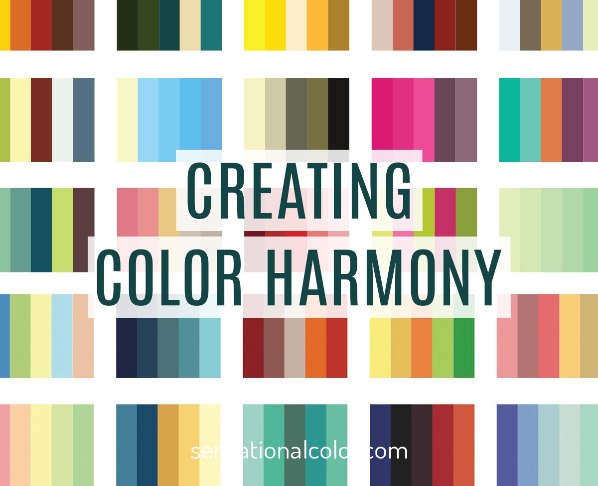
Understanding Color Harmony
Color harmony refers to the pleasing combination of colors that work well together. It involves selecting colors that complement and enhance each other, creating a cohesive and unified look.
Achieving Balance with Tints and Shades
Creating balance in your color scheme can be achieved by incorporating different tints and shades of your selected colors. Tints are created by adding white to a color, making it lighter, while shades are created by adding black, making the color darker. By using tints and shades, you can add depth and variation to your color palette.
Using the 60-30-10 Rule
The 60-30-10 rule is a helpful guideline for achieving balance in your color scheme. The dominant color should make up 60% of the project, the secondary color 30%, and the accent color 10%. This rule ensures that no single color overwhelms the others and creates a visually pleasing composition.
Balancing Warm and Cool Colors
When selecting warm and cool colors, it’s important to find a balance between the two. Too much warmth may result in a visually overwhelming project, while too much coolness may create a cold and emotionless appearance. Achieving a balance between warm and cool colors will create harmony and evoke the desired mood.
Importance of Contrast and Contrast Ratios
Contrast plays a crucial role in creating visual interest and ensuring that your colors stand out. High contrast can be achieved by pairing colors that are opposite on the color wheel, such as black and white. Contrast ratios are also important, especially when considering accessibility. A good contrast ratio ensures that colors are distinguishable for individuals with visual impairments.
Harmonizing Colors in Different Lighting
Considering how your color scheme might appear in different lighting conditions is essential for maintaining color harmony. Natural light, artificial light, and different times of the day can all have an impact on how colors appear. It’s important to test your color combinations in different lighting to ensure they maintain their desired effect.
Considering Cultural and Symbolic Meanings
Colors can hold various meanings and cultural associations. For example, red traditionally symbolizes passion and energy, while white may represent purity and innocence. Understanding the cultural and symbolic meanings attached to colors can help you create projects that resonate with your intended audience or convey a specific message.
Using Color Palettes and Tools
Color palettes and tools can be valuable resources when working on your craft projects. Color palettes provide pre-selected combinations of colors that work well together, making it easier to achieve color harmony. Tools such as color wheels and online color generators can help you explore different color combinations and find inspiration.
Exploring Online Color Resources
The internet is a treasure trove of color resources. There are countless websites and blogs dedicated to color theory, color schemes, and color inspiration. From color generators to curated color palettes, online resources can be a valuable asset when seeking inspiration and guidance for your craft projects.
Utilizing Color Wheel Apps and Websites
Color wheel apps and websites are fantastic tools for exploring different color combinations, generating color palettes, and even testing how colors look when applied to your craft project. These interactive tools allow you to experiment and play with colors, helping you find the perfect combination for your creation.
Color Harmony Techniques
Now that you have a solid understanding of color theory and how to create harmonious color schemes, let’s explore some techniques for achieving color harmony in your craft projects.
Color Blocking
Color blocking involves using solid blocks of color to create a bold and modern look. By strategically placing different colors next to each other, you can create visual interest and a sense of balance.
Gradient Blending
Gradient blending involves smoothly transitioning colors from one to another, creating a seamless and gradual shift. This technique can be achieved through various mediums, such as paints, yarns, or digital tools. Gradient blending adds depth and dimension to your projects.
Ombre Effects
Ombre effects involve transitioning colors from dark to light or vice versa in a controlled manner. This technique creates a beautiful and gradual color shift, often resembling a sunset or a fading gradient. Ombre effects can be used in various crafts, such as painting, dyeing fabrics, or even digital design.
Color Wash
Color wash is a technique where a translucent layer of color is applied over a surface, allowing some of the underlying color or texture to show through. This creates a soft and ethereal effect, perfect for adding subtle color variations and creating a dreamy atmosphere.
Layering and Texturing with Color
Layering and texturing with color involves adding multiple layers of colors or incorporating different textures to achieve a rich and multidimensional look. This technique is commonly used in painting, collage, and mixed media projects, adding depth and interest to your creations.
Creating Visual Flow with Color
Creating visual flow involves using color to guide the viewer’s eye through your craft project. By strategically placing colors or color accents, you can create a pathway or a focal point that leads the viewer’s gaze. Visual flow helps create a sense of movement and cohesion in your work.
Color Blocking Accessories
Color blocking can extend beyond the main elements of your craft project to accessories and details. By incorporating color blocking techniques into smaller components, such as buttons, beads, or trimmings, you can add a pop of color and create a cohesive look.
Gradient Variation in Patterns
If you’re working with patterns, you can introduce gradient variation to add depth and interest. By gradually shifting the colors within a pattern, you can create a dynamic and visually appealing design.
Using Color to Enhance Details
Color can be used to enhance and highlight specific details in your craft projects. By opting for a contrasting or complementary color, you can draw attention to certain elements, making them stand out and adding visual interest.
Adding Depth and Dimension with Color
Color can be used to create depth and dimension in your craft projects. By selecting colors with different values or hues and strategically applying them, you can create the illusion of depth and highlight specific areas of your creation.

Common Color Pitfalls to Avoid
While understanding color theory and employing color harmony techniques is important, it’s equally crucial to be aware of common color pitfalls to avoid in your craft projects. By avoiding these pitfalls, you can ensure that your colors work together harmoniously and enhance the overall aesthetics of your creations.
Overusing Too Many Colors
One of the biggest mistakes when it comes to color is using too many colors in a single project. This can result in a cluttered and overwhelming appearance. Instead, aim for a cohesive palette with a limited number of colors that work well together.
Lack of Contrast
Lack of contrast can make your project appear flat and uninteresting. It’s important to incorporate contrast by using colors that are distinct from each other, whether it’s through lightness or darkness, saturation, or complementary colors. A good balance of contrast will ensure that your colors complement each other without blending into one another.
Clashing Color Combinations
Certain color combinations can clash and create visual discord. Colors that are too similar or that don’t harmonize well can create an unpleasant and jarring effect. It’s important to test your color combinations and consider their visual impact before committing to a specific palette.
Ignoring Color Psychology
Colors have psychological associations and can evoke specific emotions or reactions. Ignoring color psychology can result in a project that doesn’t convey the intended message or elicit the desired response. Pay attention to the emotional impact of your color choices and ensure they align with the goals of your project.
Neglecting Color Proportions
The proportions of colors in your project can greatly affect its overall appearance. Neglecting color proportions and using color in an imbalanced way can throw off the visual harmony. Refer to the 60-30-10 rule as a general guideline to create a well-balanced color scheme.
Failing to Test Color Samples
Colors can look different when applied to different surfaces or in different lighting conditions. Failing to test color samples before finalizing your project can lead to unexpected and undesirable outcomes. Always test your color combinations on a small sample or swatch to ensure they work well together and achieve the desired effect.
Not Considering the Craft’s Purpose
Each craft project has a purpose and may be intended for a specific audience or setting. Failing to consider the craft’s purpose when choosing colors can result in a mismatch between the project and its intended context. Whether it’s a serene piece of pottery or a vibrant painting, make sure your color choices align with the purpose and setting of your craft.
Inconsistent Color Application
Consistency in color application is vital for achieving a professional and polished look. Inconsistent color application can create an unfinished or sloppy appearance. Take care to apply colors evenly and follow a consistent approach throughout your project.
Ignoring the Role of Neutrals
Neutrals, such as whites, grays, and browns, play a crucial role in balancing and grounding your color palette. Ignoring neutrals can result in an overpowering or chaotic look. Incorporate neutrals strategically to create contrast, highlight other colors, and provide visual resting points.
Disregarding Color Trends
While individual creativity is important, staying updated with color trends can provide insights and inspiration for your craft projects. Disregarding color trends completely can make your work feel outdated or disconnected from current aesthetics. Stay informed about current color trends and consider how they can be incorporated into your projects.
Color Harmonization Tips for Specific Crafts
Different crafts have their own considerations when it comes to color harmonization. Here are some tips specific to various craft mediums to help you achieve the best color combinations for your projects.
Painting and Drawing
Painting and drawing offer a wide range of color options. Experiment with different color schemes, techniques, and approaches to find the ones that evoke the desired emotions, convey the intended message, and enhance the mood of your artwork.
Knitting and Crochet
In knitting and crochet, consider the texture and drape of the yarn along with the color. Explore different color combinations that complement the stitches and patterns, taking into account the intended garment or accessory and the wearer’s style and preferences.
Sewing and Quilting
When sewing or quilting, take into account the fabrics and patterns you’re working with. Consider how different colors will interact with patterns and textures, and how they can enhance or complement the project as a whole.
Jewelry Making
In jewelry making, color choices can greatly impact the overall design. Consider the materials you’re working with, such as gemstones, beads, or metals, and how different colors can enhance their natural beauty or convey a specific style or theme.
Paper Crafts and Scrapbooking
Color plays a significant role in paper crafts and scrapbooking. Consider the theme, occasion, or story you’re showcasing in your project, and select colors that complement the content and create a cohesive visual narrative.
Ceramics and Pottery
In ceramics and pottery, color plays a unique role, especially in glazes and surface finishes. Experiment with different glazes and color combinations to achieve the desired effect and enhance the forms and textures of your ceramic creations.
Woodworking and Furniture Making
In woodworking and furniture making, color choices can greatly influence the overall aesthetics and style of the piece. Consider the type of wood you’re working with and how different stains and finishes can highlight the natural beauty of the wood or add character and depth to your creations.
Embroidery and Cross-Stitch
Embroidery and cross-stitch allow for intricate designs and detailing. Consider the fabric and threads you’re using, and how different colors can highlight the details and bring your designs to life.
Glass Art and Stained Glass
Color plays a crucial role in glass art and stained glass. Explore different glass types and color combinations to create stunning works that play with light, transparency, and the natural beauty of colored glass.
Leatherworking and Leather Crafts
In leatherworking and leather crafts, color can significantly impact the final appearance and style of the piece. Consider how different dyes and finishes will interact with the specific type of leather you’re working with, and experiment with different color choices to achieve the desired effect.

Inspiration for Color Harmonization
Finding inspiration for your color choices is essential to creating unique and visually appealing craft projects. Consider the following sources for inspiration:
Nature and the Outdoors
Nature is an abundant source of color inspiration. From vibrant flowers and lush landscapes to serene seascapes and colorful sunsets, the natural world offers an endless array of color combinations that can be adapted into your craft projects.
Art and Design Movements
Art and design movements throughout history have produced iconic color palettes that continue to inspire and resonate today. Explore movements such as Impressionism, Art Deco, or Bauhaus and their unique color harmonies for ideas and inspiration.
Fashion and Trends
The world of fashion constantly evolves, bringing forth new color trends and combinations. Look to fashion runways, magazines, and street style for inspiration on how colors are being paired and used in current trends.
Cultural Influences
Different cultures have their own distinct color palettes and combinations that reflect their traditions and heritage. Explore the colors and patterns used in various cultures’ textiles, artwork, and architecture for unique and culturally rich inspiration.
Interior Design and Home Decor
Interior design and home decor provide a wealth of inspiration for color combinations. Look to magazines, online platforms, and design books to see how different colors are being used to create inviting and harmonious spaces.
Vintage and Retro Styles
Vintage and retro styles have a charm and nostalgia that can inspire unique color combinations. Look to the color palettes and design elements of different eras, such as the 1950s or the Art Nouveau period, for inspiration that is both timeless and evocative.
Iconic Color Combinations
Certain color combinations have become iconic and instantly recognizable. Examples include black and white, red and white for Coca-Cola, or the colors of the rainbow. Look to these iconic combinations for inspiration and consider how you can incorporate them into your craft projects.
Personal Color Stories
Your personal experiences and memories can serve as a rich source of color inspiration. Reflect on significant moments, places, or emotions, and consider how the colors associated with those experiences can be translated into your craft projects.
Color in Different Seasons
The changing seasons bring with them unique color palettes. From the vibrant colors of spring to the warm and cozy hues of fall, each season offers its own inspiration. Consider how the colors of each season can be incorporated into your craft projects.
Exploring Color Palettes from Paintings
Many famous paintings have color palettes that are revered and studied by artists and designers alike. Explore the color harmonies of renowned artworks and see how they can inspire your own craft projects.
Color Harmonization in Marketing Crafts
Color harmony is not only important for creating visually appealing craft projects but can also play a significant role in marketing your crafts. The colors you choose can elicit emotions, reinforce brand identity, and attract your target audience.
Understanding Target Audiences
Understanding your target audience is vital for selecting colors that resonate with them. Consider their preferences, demographics, and the emotions you want to evoke in order to craft color combinations that appeal to your specific audience.
Brand Identity and Color
If you’re marketing your crafts as part of a brand, it’s important to consider your brand identity and how color can reinforce it. Select colors that align with your brand’s values, personality, and the emotions or associations you want to convey.
Creating Cohesive Product Lines
If you have multiple craft products under your brand, creating a cohesive color scheme can help tie your products together visually. This creates a sense of unity and brand recognition. Consider using a consistent color palette or incorporating a signature color that is synonymous with your brand.
Using Color to Evoke Emotions
Color has the power to evoke specific emotions or moods. When marketing your crafts, consider the emotions you want your customers to feel when interacting with your products. Whether it’s excitement, calmness, or happiness, select colors that align with those emotions.
Packaging and Presentation
The colors you use in your packaging and presentation can greatly impact the perceived value and appeal of your crafts. Select colors that complement your craft products and create a cohesive and visually pleasing package that stands out.
Photography and Styling
Color plays an important role in product photography and styling. Consider the colors in your background, props, and lighting to create a visually appealing composition that enhances the beauty and unique qualities of your crafts.
Utilizing Social Media and Websites
Consistent color use across your social media platforms and websites helps create a cohesive brand experience. Use colors that align with your branding and craft projects to establish a recognizable and visually appealing online presence.
Collaborations and Cross-Promotions
When collaborating with other crafters or businesses, ensure that your color palettes complement each other and create a cohesive look. By cross-promoting and aligning your colors, you can create a visually appealing and unified experience for your customers.
Staying Updated with Color Trends
Color trends change over time, and staying updated with the latest color trends can help your crafts feel current and relevant. Keep an eye on color forecasting agencies, fashion trends, and design publications to ensure your color choices resonate with contemporary aesthetics.
Measuring and Analyzing Color Success
Once your crafts are out in the market, it’s important to measure and analyze the success of your color choices. Monitor customer feedback, sales, and customer engagement to gauge the effectiveness of your color combinations and make any necessary adjustments.

Tips for Experimenting with Color
Experimenting with color is a great way to expand your creative horizons and discover unique combinations. Here are some tips to help you embrace experimentation and find your own color harmonization style:
Start with Small Projects or Samples
If you’re hesitant to fully commit to a new color combination, start small. Begin with smaller crafts or create color samples to test different combinations and see how they work together. This allows you to experiment and make adjustments without a large investment of time or materials.
Keep a Color Journal
Maintaining a color journal can help you keep track of color combinations you find inspiring or want to experiment with. Whenever you come across a unique color pairing or color scheme, jot it down or create a visual reference. Your color journal can serve as a source of inspiration when you’re feeling stuck or want to try something new.
Try Unexpected Color Combinations
Sometimes the most interesting and visually appealing color combinations come from unexpected pairings. Don’t limit yourself to traditional color schemes and explore combinations that may initially seem unconventional. You may discover new and exciting color harmonies that bring a fresh perspective to your craft projects.
Challenge Yourself with Limited Palettes
Working with limited palettes can be a great exercise in creativity and color harmonization. Choose a limited number of colors and challenge yourself to create depth, interest, and harmony within those constraints. This exercise can help you develop a more discerning eye for color combinations and find new ways to achieve harmony.
Seek Feedback and Critiques
Don’t be afraid to seek feedback and critiques on your color choices from trusted peers or mentors. Their fresh perspectives and insights can provide valuable feedback and help you refine your color combinations. Constructive criticism can push your creative boundaries and lead to new discoveries.
Attend Color Workshops or Classes
Attending color workshops or classes can provide you with hands-on experience and guidance from experts in the field. These learning experiences can deepen your understanding of color theory and help you develop your eye for color harmonization.
Learn from Color Experts and Artists
Seek inspiration and guidance from color experts and artists who have mastered the art of color harmonization. Study their techniques, explore their color choices, and learn from their experiences. This will help you expand your knowledge and refine your own approach to color harmonization.
Customize Color Recipes and Formulas
If you work with mediums that involve mixing colors, such as paints or dyes, don’t be afraid to customize color recipes and formulas. Experiment with different ratios, pigments, or additives to create unique hues that perfectly match your vision.
Take Inspiration from Other Crafts
Color harmonization does not exist in a vacuum. Take inspiration from other crafts and disciplines to explore new color combinations and approaches. Look to fields such as graphic design, architecture, or fashion and see how their color choices can be adapted to your craft projects.
Embrace the Joy of Color
Above all, embrace the joy of color. Color is a powerful tool for self-expression, creativity, and evoking emotions. Have fun with your craft projects, experiment fearlessly, and allow color to inspire and guide you on your creative journey.
Conclusion
Understanding color theory and how to create harmonious color combinations is a valuable skill in the world of crafting. From the color wheel to exploring different color schemes, we have covered the foundations of color theory. We have also discussed creating a color scheme, color harmonization techniques, common color pitfalls to avoid, and tips for experimenting with color.
By mastering the art of color harmonization, you can elevate your craft projects and create visually stunning and emotionally impactful creations. Remember to consider the purpose and mood of your project, take into account the craft medium, and explore different color scheme options. Use color harmoniously to achieve balance, contrast, and depth in your projects.
Whether you’re a painter, knitter, jewelry maker, or any other type of crafter, color harmony is an essential tool in your creative arsenal. Embrace the beauty and power of color, and let it guide you as you bring your craft projects to life. Happy crafting!