Get ready to unleash your creativity with our engaging article, “Color Theory 101: A Beginner’s Guide to Crafting with Beautiful Color Palettes.” Whether you’re a newbie in the crafting world or simply looking to enhance your color skills, this guide will take you on a fun journey through the exciting realm of color theory. Discover the secrets behind selecting harmonious color combinations and learn how to elevate your crafts to a whole new level. So grab your paintbrushes, gather your materials, and let’s dive into the captivating world of color!

Understanding Color Theory
Primary, Secondary, and Tertiary Colors
Color theory forms the foundation of any successful crafting project. By understanding the basics of color theory, you can confidently select color combinations that harmonize and enhance your crafts. The primary colors, namely red, blue, and yellow, are the building blocks of all other colors. By mixing primary colors, you can create the secondary colors: orange, green, and purple. Tertiary colors, on the other hand, are the result of mixing primary and secondary colors together. Understanding these color categories gives you a solid grounding in color theory.
The Color Wheel
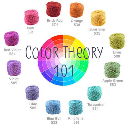
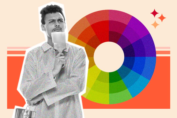
The color wheel is a visual representation of color relationships. It provides a systematic way to organize and understand how colors work together. The traditional color wheel consists of twelve colors, including the primary, secondary, and tertiary colors mentioned earlier. As you move around the color wheel, you’ll notice that colors shift and change. This represents the varying relationships between colors and their harmonious or contrasting qualities. The color wheel acts as a valuable tool for selecting color palettes that evoke different moods and aesthetics in your crafts.
Color Schemes
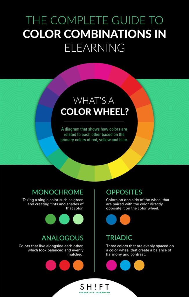
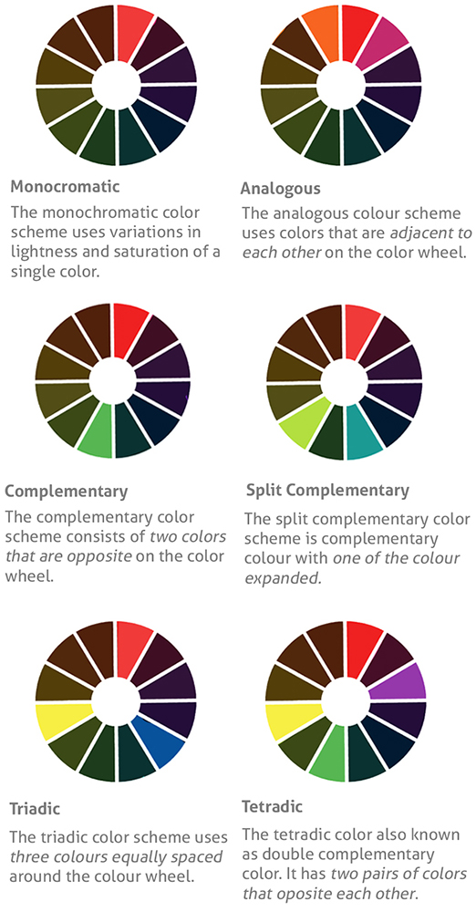
Color schemes are predefined combinations of colors that are pleasing to the eye and create a specific effect. There are numerous color schemes to choose from, each with its own unique qualities. Some popular color schemes include monochromatic, analogous, complementary, split-complementary, triadic, and tetradic. Each of these schemes offers a different way to combine colors and create a harmonious or contrasting effect in your crafts. By understanding and utilizing different color schemes, you can take your crafting to the next level and achieve stunning results.
Using Color Symbolism
Understanding Color Meanings
Colors have symbolic meanings that can evoke certain emotions and convey specific messages. Understanding the psychological effects of colors can empower you to create crafts with deeper meanings. For example, red often symbolizes passion, love, and excitement, while blue is associated with calmness, tranquility, and trust. Yellow, on the other hand, represents happiness, optimism, and energy. By intentionally integrating these color meanings into your crafts, you can create a stronger emotional impact and effectively communicate your desired message.
Applying Color Symbolism in Crafting
Integrating color symbolism into your crafts can add an extra layer of depth and meaning, transforming them into more than just visually appealing objects. For example, if you’re creating a scrapbook to celebrate a milestone anniversary, incorporating red can symbolize the enduring love and passion between the couple. Similarly, using green in a project inspired by nature can evoke feelings of growth, renewal, and harmony. By carefully considering the color meanings and incorporating them into your crafting process, you can create pieces that resonate with both you and your audience on a deeper level.
Working with Warm and Cool Colors
Differentiating Warm and Cool Colors
Warm and cool colors are two distinct categories that evoke different emotions and create different atmospheres. Warm colors, such as red, orange, and yellow, tend to create a sense of energy, warmth, and excitement. On the other hand, cool colors like blue, green, and purple often evoke feelings of calmness, serenity, and peacefulness. Understanding the differences between warm and cool colors is crucial when trying to convey a specific mood or ambience in your crafts.
Creating Contrast with Warm and Cool Colors
One effective way to add visual interest and create contrast in your crafts is by pairing warm and cool colors together. The juxtaposition of these contrasting colors can make your crafts visually striking and dynamic. For example, pairing a vibrant orange with a calming shade of blue can create a captivating visual contrast. By understanding how warm and cool colors interact and complement each other, you can create crafts that are visually captivating and pleasing to the eye.
Exploring Monochromatic Palettes
What is a Monochromatic Palette?
A monochromatic palette consists of different shades, tints, and tones of a single color. By using various intensities of one color, you can create a cohesive and harmonious look in your crafts. Monochromatic palettes provide a sense of elegance, simplicity, and sophistication. They’re particularly useful when you want to create a serene or minimalist aesthetic in your crafts.
Creating Depth and Interest with Monochromatic Colors
Contrary to popular belief, working with a monochromatic palette doesn’t mean your crafts will lack variety or interest. By experimenting with different shades and tones within the same color family, you can create depth and dimension. For example, using lighter shades of a color as a background and accenting it with darker shades can bring dimensionality to your crafts. Monochromatic palettes provide a solid foundation for showcasing texture, patterns, and other design elements in your crafts.

Experimenting with Analogous Colors
What are Analogous Colors?
Analogous colors are colors that sit next to each other on the color wheel. They share similar qualities and create a harmonious, unified look when used together. For example, a combination of yellow, yellow-orange, and orange is an analogous color scheme. Analogous colors are great for creating a pleasing and balanced aesthetic in your crafts.
Using Analogous Colors in Crafts for a Harmonious Look
Analogous color schemes are versatile and can be used to evoke different emotions and aesthetics. By choosing analogous colors that align with the mood or theme of your crafts, you can create a harmonious and visually appealing result. For instance, using varying shades of blue and green in a coastal-themed craft can create a sense of tranquility and relaxation. By understanding how analogous colors work together, you can create crafts that are visually pleasing and cohesive.
Creating Vibrant Complementary Color Palettes
Understanding Complementary Colors
Complementary colors are pairs of colors that sit directly opposite each other on the color wheel. These color combinations create a vibrant and high-contrast effect. For example, red and green, blue and orange, or yellow and purple are complementary pairs. Complementary colors enhance each other when used together, creating a visually captivating result.
Complementary Deception: Subduing Intensity
While complementary color pairs can be visually powerful, sometimes their high intensity can be overwhelming. To mitigate this and create a more balanced result, you can use tints, shades, or tones of the complementary colors. By adjusting the intensity of the colors, you can maintain the dynamic effect while achieving a more harmonious and pleasing look in your crafts. Play around with different combinations and variations to find the perfect balance for your project.

Using Split-Complementary Color Schemes
What is a Split-Complementary Color Scheme?
A split-complementary color scheme is a variation of the complementary color scheme. Instead of using one complementary pair, it uses the base color and the two colors adjacent to its complement. For example, if the base color is blue, the split-complementary scheme could include blue, yellow-orange, and yellow-green. This color scheme offers a balanced and visually interesting combination.
Achieving Balance with Split-Complementary Color Palettes
Split-complementary color palettes provide a great opportunity to create balanced and dynamic crafts. By incorporating the base color along with the adjacent colors from the color wheel, you can achieve a cohesive and visually appealing result. This color scheme offers more diversity and variation than a traditional complementary scheme while still maintaining a visually harmonious look. Experimenting with split-complementary colors can bring vibrancy and excitement to your crafts.
Unleashing the Power of Triadic Color Combinations
Exploring the Triadic Color Harmony
Triadic color combinations consist of three colors spaced evenly around the color wheel. These combinations are visually vibrant and create a sense of balance and harmony. For example, a triadic combination can include red, blue, and yellow. Triadic colors are excellent for creating visually stunning and engaging crafts.
Using Triadic Colors in Crafts with Confidence
Triadic color combinations provide a wide range of possibilities for your crafts. By utilizing three distinct colors that span the color wheel, you can create a visually striking and balanced result. When working with triadic colors, it’s important to consider the intensity and proportion of each color to achieve a harmonious look. With careful planning and experimentation, you can incorporate triadic colors into your crafts with confidence and create captivating pieces.

Harmonizing with Tetradic Color Palettes
Understanding Tetradic Color Schemes
Tetradic color schemes, also known as double-complementary or rectangular color schemes, consist of four colors arranged into two complementary pairs. These color combinations can bring boldness and vibrancy to your crafts. For example, a tetradic combination could include blue, violet, orange, and yellow. By using four distinct and contrasting colors, you can create crafts that demand attention and make a bold statement.
Creating Bold and Balanced Crafts with Tetradic Colors
Working with tetradic color schemes requires careful consideration and balance. To avoid overwhelming your crafts, it’s essential to identify a dominant color and use the remaining colors as accents. By establishing a hierarchy among the four colors, you can create a visually pleasing and balanced result. Tetradic color palettes provide an opportunity to experiment with bold and vibrant combinations, allowing your crafts to stand out and make a lasting impression.
Embracing Color Psychology
The Psychological Effects of Colors
Colors have the power to evoke specific emotions and create psychological responses. Understanding the psychological effects of colors can help you craft with intention and purpose. For example, warm colors like red and orange can evoke feelings of excitement and energy, making them ideal for crafts that aim to create a sense of urgency or attention. On the other hand, cool colors like blue and green can evoke a sense of calm and relaxation, making them suitable for projects that aim to create a soothing or tranquil atmosphere.
Using Color Psychology to Evoke Emotions in Crafting
By leveraging color psychology, you can create crafts that elicit specific emotions and reactions from your audience. Consider the mood or message you want to convey with your craft and choose colors that align with those intentions. For example, if you’re creating a piece of art to promote relaxation and stress relief, using cool and soothing colors like shades of blue and green can help achieve that effect. The intentional use of colors can elevate your crafts and create a more impactful experience for both you and your audience.
In conclusion, understanding color theory and exploring different color palettes and combinations is essential for any crafter. By grasping the concepts of primary, secondary, and tertiary colors, as well as the color wheel and various color schemes, you can confidently select colors that harmonize and enhance your crafts. Additionally, utilizing color symbolism, warm and cool colors, monochromatic and analogous palettes, complementary and split-complementary combinations, triadic and tetradic harmonies, as well as the psychological effects of colors, will unlock endless creative possibilities and allow you to create crafts that are visually captivating and emotionally impactful. So go ahead, embrace the power of color, and embark on a journey of harmonious and beautiful crafting.


