Crafting with Colors: Mastering the Art of Harmonious Combinations is an article that takes you on a journey into the world of color theory, helping you become a master at selecting harmonious color combinations for your crafts. From understanding the basics of color theory to exploring different ways to create visually appealing color palettes, this article is your ultimate guide. Whether you enjoy painting, scrapbooking, or even knitting, this article has got you covered with expert tips and techniques to elevate your crafting projects to a whole new level. Get ready to immerse yourself in the art of color and unleash your creativity like never before!

Understanding Color Theory
Color theory is the study of how colors interact and how they can be combined to create visually pleasing compositions. By understanding the principles of color theory, you can effectively use colors in your crafting projects to create harmonious and eye-catching results.
Primary Colors
Primary colors are the foundation of all other colors. These colors cannot be created by mixing other colors together. The three primary colors are red, blue, and yellow. They are often referred to as the “building blocks” of color, as they can be mixed together to create all other colors on the color wheel.
Secondary Colors
Secondary colors are created by mixing two primary colors together. The three secondary colors are orange (red + yellow), green (yellow + blue), and purple (blue + red). These colors are vibrant and can add a pop of excitement to your crafts.
Tertiary Colors
Tertiary colors are created by mixing a primary color with a neighboring secondary color. There are six tertiary colors in total: red-orange, yellow-orange, yellow-green, blue-green, blue-purple, and red-purple. Tertiary colors are often used to add depth and variety to color schemes.
Color Wheel
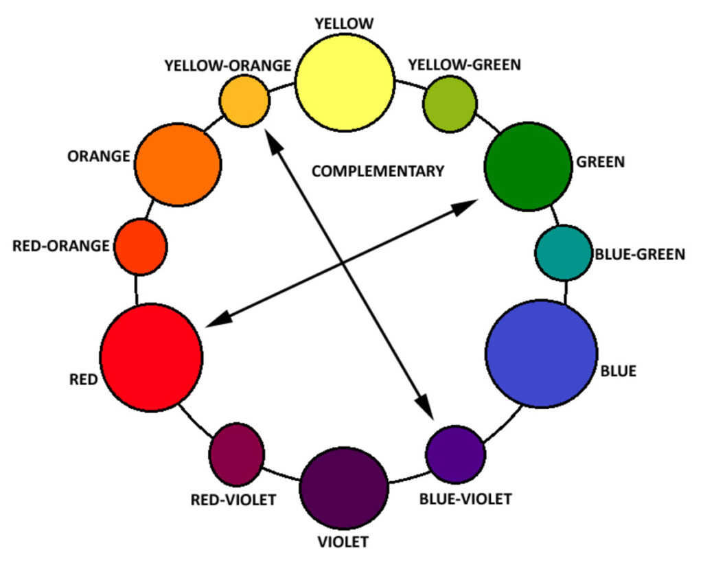
The color wheel is a visual representation of the relationships between colors. It consists of twelve colors arranged in a circle. The primary colors are evenly spaced around the wheel, with the secondary and tertiary colors filling in the gaps between them. The color wheel is a valuable tool for understanding color relationships and creating harmonious color combinations.
Color Harmony in Crafting
Color harmony refers to the pleasing combination and arrangement of colors. By understanding different color harmonies, you can create crafts that are visually appealing and balanced.
Complementary Colors
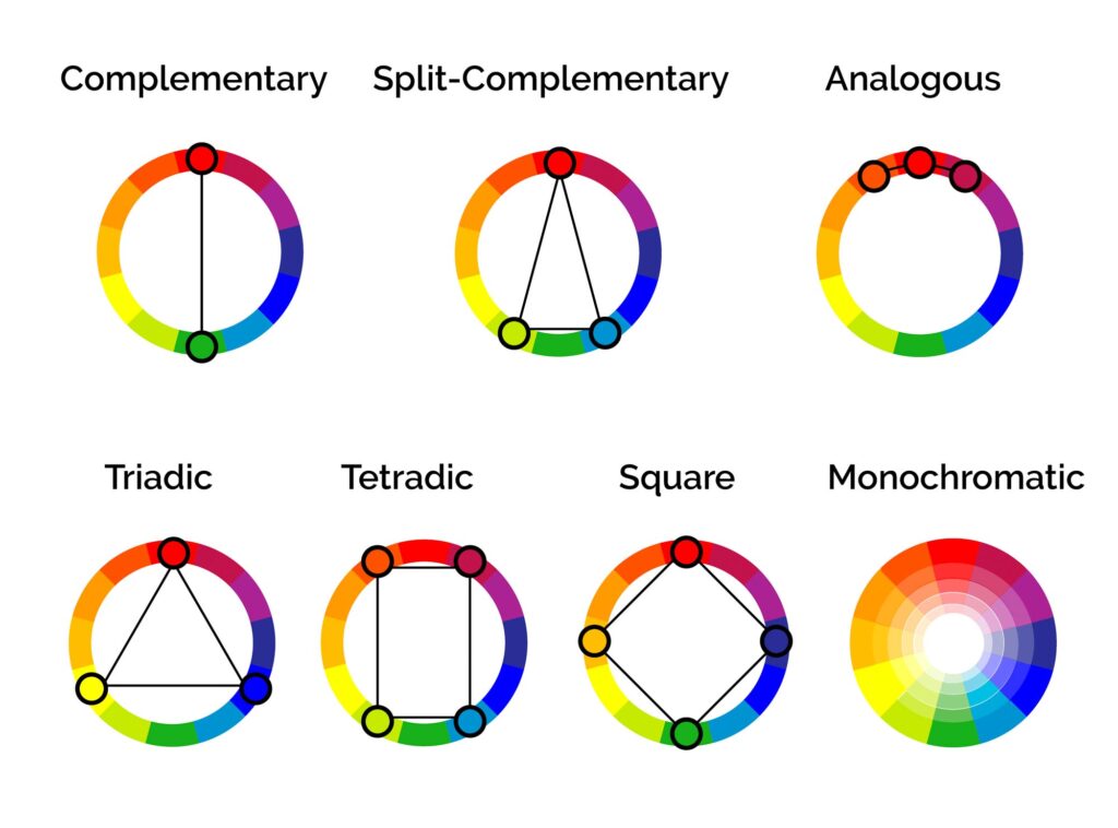
Complementary colors are opposite each other on the color wheel. They create a high contrast and are visually striking when paired together. Examples of complementary color combinations include red and green, blue and orange, and yellow and purple. Adding complementary colors to your crafts can create a bold and dynamic effect.
Analogous Colors
Analogous colors are adjacent to each other on the color wheel. They share similar hues and create a subtle and harmonious color scheme. Examples of analogous color combinations include blue-green and green-yellow, orange-red and red-purple, and yellow-green and blue-green. Using analogous colors can create a cohesive and calming effect in your crafts.
Triadic Colors
Triadic colors are evenly spaced around the color wheel and create a well-balanced color scheme. Examples of triadic color combinations include red, blue, and yellow, or orange, green, and purple. Using triadic colors in your crafts can create a vibrant and energetic feel.
Monochromatic Colors
Monochromatic colors are different shades, tones, and tints of a single hue. This color scheme creates a harmonious and sophisticated look. Using different shades of blue or various tints of pink, for example, can create a monochromatic color scheme in your crafts.
Creating Harmonious Color Combinations
When creating harmonious color combinations for your crafts, there are several factors to consider.
Consider the Mood
Different colors evoke different emotions and moods. Warm colors like red, orange, and yellow create a sense of energy and excitement, while cool colors like blue, green, and purple create a calming and relaxing atmosphere. Consider the mood you want to convey in your craft and choose colors accordingly.
Understand Color Temperature
Colors can be classified as either warm or cool based on their position on the color wheel. Warm colors are those with undertones of red, orange, and yellow, while cool colors have undertones of blue, green, and purple. Understanding color temperature can help you create a balanced and visually pleasing color combination.
Balance Warm and Cool Tones
To create a harmonious color combination, it is important to balance warm and cool tones. Combining warm and cool colors can create a dynamic and visually appealing contrast. For example, pairing a warm orange with a cool blue can create a striking and balanced color combination.
Use Neutrals to Enhance
Neutrals such as black, white, gray, and beige can be used to enhance the colors in your craft. They can act as a backdrop or accentuate the main colors. Neutrals can also help create a sense of balance and sophistication in your crafts.
Experiment with Different Intensities
Colors can have different intensities, ranging from vibrant and bold to muted and soft. Experimenting with different intensities of the same color or combining contrasting intensities can add depth and visual interest to your crafts. Don’t be afraid to play with different shades, tones, and tints to achieve the desired effect.
Working with Primary Colors
Primary colors are the essential building blocks of color theory. Each primary color brings its own unique qualities and can be used to create a variety of effects in your crafts.
Using Red
Red is a powerful and energetic color that can evoke feelings of passion and excitement. It is often associated with love and can add warmth to your crafts. Incorporating red into your projects can create a focal point or draw attention to specific elements.
Incorporating Blue
Blue is a calming and soothing color that can create a sense of tranquility in your crafts. It is often associated with water and the sky and can add a sense of depth and serenity. Incorporating blue into your projects can create a cool and refreshing atmosphere.
Exploring Yellow
Yellow is a cheerful and optimistic color that can bring a sense of joy to your crafts. It is often associated with sunshine and can add a bright and vibrant element. Exploring different shades and tones of yellow in your projects can create a lively and uplifting effect.
Exploring Secondary Colors
Secondary colors are created by mixing two primary colors together. These colors have their own unique qualities and can add vibrancy and excitement to your crafts.
Working with Orange
Orange is a warm and energetic color that combines the vibrancy of red with the cheerfulness of yellow. It can add a sense of warmth and enthusiasm to your crafts. Working with orange can create a visually stimulating and lively effect.
Incorporating Green
Green is a refreshing and calming color that represents nature and the environment. It can add a sense of balance and harmony to your crafts. Incorporating green can create a fresh and organic feel in your projects.
Exploring Purple
Purple is a rich and luxurious color that combines the intensity of red with the tranquility of blue. It is often associated with creativity and spirituality. Exploring different shades and tones of purple in your projects can create a sense of mystery and elegance.
Tertiary Colors for Depth and Variety
Tertiary colors are created by mixing a primary color with a neighboring secondary color. These colors can add depth, variety, and complexity to your color schemes.
Using Red-Orange
Red-orange is a bold and fiery color that combines the intensity of red with the warmth of orange. It can add a sense of excitement and energy to your crafts. Using red-orange can create a visually captivating and passionate effect.
Incorporating Yellow-Green
Yellow-green is a vibrant and fresh color that combines the brightness of yellow with the earthiness of green. It can add a sense of vitality and renewal to your crafts. Incorporating yellow-green can create a lively and invigorating atmosphere.
Exploring Blue-Purple
Blue-purple is a deep and mysterious color that combines the tranquility of blue with the intensity of purple. It can add a sense of sophistication and elegance to your crafts. Exploring different shades and tones of blue-purple can create a sense of depth and intrigue.
Understanding the Color Wheel
The color wheel is an essential tool for understanding color relationships and creating harmonious color schemes. It is divided into primary, secondary, and tertiary colors, each with its own unique properties.
Primary, Secondary, and Tertiary Relationships
Primary colors are the foundation of the color wheel, and all other colors can be created by mixing them. Secondary colors are created by mixing two primary colors together, while tertiary colors are created by mixing a primary color with a neighboring secondary color. Understanding these relationships can help you create balanced and visually pleasing color combinations.
Creating Harmonious Color Schemes with the Wheel
By using the color wheel, you can easily create harmonious color schemes for your crafts. One common technique is to choose colors that are adjacent or near each other on the color wheel, creating an analogous color scheme. Another technique is to choose colors that are opposite each other on the color wheel, creating a complementary color scheme. Experimenting with different color schemes can help you create unique and visually stunning crafts.
Complementary Colors for Bold Contrast
Complementary colors are opposite each other on the color wheel and can create a bold and visually striking contrast. Using complementary colors in your crafts can make certain elements stand out and create a dynamic effect.
Combining Red and Green
Combining red and green creates a powerful and traditional complementary color combination. The vibrant and warm red pairs beautifully with the refreshing and cool green. Using this combination in your crafts can create a bold and eye-catching contrast.
Pairing Blue and Orange
Pairing blue and orange creates a vibrant and energetic complementary color combination. The calming and cool blue contrasts with the warm and cheerful orange. Using this combination in your crafts can create a visually stimulating and dynamic effect.
Using Yellow and Purple
Using yellow and purple creates a lively and regal complementary color combination. The bright and sunny yellow contrasts with the deep and luxurious purple. Using this combination in your crafts can create a sense of playfulness and sophistication.
Analogous Colors for Subtle Harmony
Analogous colors are adjacent to each other on the color wheel and share similar hues. They create a subtle and harmonious color scheme that can bring a sense of unity to your crafts.
Working with Blue-Green and Green-Yellow
Working with blue-green and green-yellow creates a refreshing and nature-inspired analogous color combination. The cool and calming blue-green blends seamlessly with the fresh and vibrant green-yellow. Using this combination in your crafts can create a soothing and harmonious effect.
Pairing Orange-Red and Red-Purple
Pairing orange-red and red-purple creates a warm and fiery analogous color combination. The energetic and bold orange-red transitions smoothly into the rich and intense red-purple. Using this combination in your crafts can create a visually stimulating and captivating effect.
Using Yellow-Green and Blue-Green
Using yellow-green and blue-green creates a lively and vibrant analogous color combination. The bright and cheerful yellow-green complements the cool and refreshing blue-green. Using this combination in your crafts can create a sense of freshness and energy.
Experimenting with Different Intensities
The intensity of color refers to its brightness or dullness. Experimenting with different intensities can add depth and visual interest to your crafts.
Creating High Contrast with Vibrant Colors
Using vibrant and bold colors can create a high contrast and make certain elements in your crafts stand out. Pairing a vibrant red with a vivid blue, for example, can create a striking and attention-grabbing effect. Experimenting with different intensities of vibrant colors can add energy and excitement to your crafts.
Using Pastels for a Soft Look
Pastel colors have a softer and more delicate appearance. Using pastel shades of pink, blue, or green in your crafts can create a gentle and dreamy atmosphere. Pastel colors are often associated with femininity and can add a touch of elegance to your projects.
Exploring Earth Tones for Natural Crafts
Earth tones are colors inspired by nature, such as browns, greens, and beiges. Using earth tones in your crafts can create a warm and organic feel. Whether you’re working on a rustic wooden project or creating a nature-inspired artwork, exploring different shades of earth tones can add a touch of natural beauty to your crafts.
Crafting with colors is an art form that requires careful consideration and experimentation. By understanding color theory, exploring different color harmonies, and experimenting with different intensities, you can create crafts that are visually stunning and harmonious. Whether you’re using primary, secondary, or tertiary colors, or exploring complementary or analogous color schemes, the possibilities are endless. So let your creativity flow and have fun crafting with colors!

