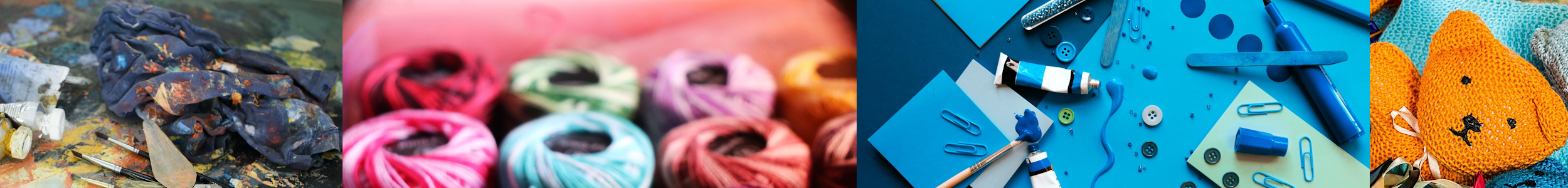

Crafting with Confidence: How to Master the Art of Color in Your Projects is an article that aims to provide you with the tools and knowledge to confidently use color in your crafting endeavors. Whether you’re a beginner or an experienced crafter, understanding how to choose and combine colors can elevate the quality of your projects. With tips and insights on color theory and harmonious color combinations, this guide will help you unleash your creative potential and create beautiful, eye-catching crafts that make a statement. Get ready to dive into the world of color and unleash your inner artist!

Understanding Color Theory
Color theory is the foundation of creating visually appealing and harmonious craft projects. By understanding the basic principles of color theory, you can confidently select colors that complement each other and evoke specific emotions.
The Basics of Color Theory
Color theory revolves around the color wheel, which is a visual representation of all the colors in the spectrum. The color wheel is divided into three main categories: primary, secondary, and tertiary colors. Primary colors are the foundation of all other colors and cannot be created by mixing other colors. They include red, blue, and yellow. Secondary colors are created by mixing two primary colors together. They include green, orange, and purple. Tertiary colors are created by mixing a primary color with a secondary color and are located between the primary and secondary colors on the color wheel.
Color Mixing and Harmonies
Understanding how to mix colors is essential for creating harmonious color schemes in your craft projects. By mixing different colors together, you can create unique shades and tones. Color harmonies refer to the combinations of colors that work well together and create a sense of balance and visual appeal. Some common color harmonies include complementary, analogous, and monochromatic schemes. Complementary colors are opposite each other on the color wheel and create a dynamic contrast. Analogous colors are located next to each other on the color wheel and create a harmonious and cohesive look. Monochromatic color schemes consist of different shades and tones of the same color.
Primary, Secondary, and Tertiary Colors
As mentioned earlier, primary colors are red, blue, and yellow. These colors cannot be created by mixing other colors together and are considered the building blocks of all other colors. Secondary colors are created by mixing two primary colors together. Red and blue create purple, blue and yellow create green, and red and yellow create orange. Tertiary colors are created by mixing a primary color with a secondary color. Examples of tertiary colors include blue-green, red-purple, and yellow-orange.
Selecting Colors for Your Craft Projects
Choosing the right colors for your craft projects can greatly impact the overall aesthetic and mood. Consider the purpose and mood you want to convey with your project before selecting colors.
Consider the Purpose and Mood
Think about the purpose of your craft project and the emotions or mood you want to evoke. For example, if you’re creating a piece of artwork for a child’s bedroom, you may want to use vibrant and playful colors to create a lively and energetic atmosphere. On the other hand, if you’re making a relaxation kit, you may opt for calming and soothing colors like blues and greens to create a sense of serenity.
Choosing Colors that Complement
When selecting colors for your craft projects, it’s important to choose colors that complement each other. Complementary colors are opposite each other on the color wheel and create a visually striking contrast. For example, pairing blue with orange or red with green can create a vibrant and eye-catching combination. It’s also important to consider the values and saturation levels of the colors you choose. Colors with similar saturation levels tend to work well together, while a mixture of bright and muted colors can create an interesting visual contrast.
Using Color Tools and Resources
If you’re unsure about which colors to choose for your craft projects, there are various color tools and resources available to help you. Online color palette generators allow you to explore different color combinations and see how they work together. You can also use color swatch books or visit your local art supply store to find inspiration. Don’t be afraid to experiment with different color combinations and trust your intuition when selecting colors.

The Importance of Color Palettes
Creating a cohesive color palette is key to achieving a polished and professional look in your craft projects. A well-planned color palette can tie all the elements of your project together and create a sense of unity.
Creating a Cohesive Color Palette
To create a cohesive color palette, start by selecting a main color or two that will serve as the focal point of your project. Then, choose a few complementary or analogous colors that will enhance and support the main color. It’s important to consider the proportion of each color within your project to ensure a balanced composition. You can also experiment with using different shades and tones of the same color to add depth and dimension to your palette.
Exploring Monochromatic Palettes
Monochromatic color palettes consist of different shades and tones of a single color. This type of color palette can create a sophisticated and elegant look. To create a monochromatic palette, start with your chosen base color and then explore its lighter and darker variations. Adding white or black to your base color can create lighter tints or darker shades, respectively. Monochromatic palettes are versatile and can work well in a variety of craft projects.
Working with Analogous and Complementary Color Schemes
Analogous color schemes consist of colors that are located next to each other on the color wheel. These schemes create a harmonious and cohesive look. For example, a combination of blue, green, and yellow can create a calming and natural aesthetic. Complementary color schemes, on the other hand, consist of colors that are opposite each other on the color wheel. This type of color scheme creates a vibrant and dynamic contrast. Experiment with different combinations of analogous and complementary colors to find the one that best suits your project.
Color Psychology and its Application
Colors have the power to evoke emotions and create a specific atmosphere. By understanding color psychology, you can intentionally use colors to enhance the mood and impact of your craft projects.
Understanding the Psychology of Colors
Different colors have different psychological associations. For example, blue is often associated with calmness and serenity, while red is associated with energy and passion. Understanding these associations can help you choose colors that align with the desired mood or message of your project. Consider the emotions you want your project to convey and choose colors accordingly.
Using Colors to Evoke Emotions
When selecting colors for your craft projects, think about the emotions you want to evoke in the viewer. Warm colors like red, orange, and yellow can create a sense of warmth and energy, while cool colors like blue and green can create a calming and soothing atmosphere. Bright and vibrant colors can evoke feelings of happiness and excitement, while muted and pastel colors can create a sense of tranquility and nostalgia. Be intentional with your color choices to effectively convey the desired emotions.
Crafting with Intentional Color Choices
By combining your knowledge of color theory and color psychology, you can make intentional color choices in your craft projects. Consider how different colors work together to create a specific mood or atmosphere. Experiment with different color combinations and consider the impact they have on the overall aesthetic of your project. Don’t be afraid to trust your instincts and use colors that resonate with you personally. Crafting with intentional color choices allows you to infuse your projects with your own unique style and personality.

Creating Contrast and Visual Interest
Contrast is an important element in creating visually interesting and dynamic craft projects. By understanding different techniques for creating contrast, you can make your colors pop and bring visual impact to your creations.
Exploring Value and Contrast
Value refers to the lightness or darkness of a color. By using colors with different values, you can create contrast and make certain elements stand out. For example, pairing a light pastel color with a dark, bold color can create a striking contrast. It’s important to consider the overall composition of your project and strategically place colors with different values to create visual interest.
Using Warm and Cool Colors
Warm colors like red, orange, and yellow can create a vibrant and energetic atmosphere, while cool colors like blue and green can create a calm and soothing effect. By using a combination of warm and cool colors, you can create a balanced contrast and bring visual interest to your craft projects. Experiment with different warm and cool color combinations to find the ones that resonate with your project.
Incorporating Texture and Patterns
Texture and patterns can also add visual interest and contrast to your craft projects. Consider incorporating different textures, such as fabric or textured paper, to create a tactile experience. Patterns, whether through stencils, stamps, or hand-drawn designs, can add depth and dimension to your project. By combining contrasting colors with texture and patterns, you can create a visually captivating piece that engages the viewer.
Color Techniques for Different Crafts
Different crafts require different color techniques to achieve the desired effect. Understanding how to apply color in various craft mediums can help you create stunning and vibrant projects.
Color Blending in Painting and Drawing
In painting and drawing, color blending techniques can be used to create smooth transitions between colors. This technique involves layering and blending different colors to create depth and dimension. Whether you’re working with acrylics, watercolors, or colored pencils, practicing color blending techniques can help you achieve realistic and vibrant results.
Dyeing and Coloring Fabrics
Color plays a crucial role in fabric art and dyeing. Whether you’re working with natural fibers or synthetic fabrics, there are various techniques you can use to achieve vibrant and long-lasting colors. Some popular fabric coloring techniques include tie-dyeing, batik, and immersion dyeing. Experimenting with different dyeing techniques can open up a world of possibilities for adding color to your fabric projects.
Colorful Embroidery and Cross Stitch
Embroidery and cross stitch allow you to add intricate and colorful designs to your craft projects. Whether you’re embellishing clothing, accessories, or home decor items, selecting the right colors for your embroidery or cross stitch can greatly enhance the overall design. Consider using a combination of contrasting and complementary colors to create visually stunning embroidery or cross stitch pieces.

Using Color Blocking and Color Gradients
Color blocking and color gradients are techniques that can add bold and eye-catching effects to your craft projects. By strategically dividing your project into distinct color blocks or transitioning colors through gradients, you can create visually striking and dynamic pieces.
Creating Bold Color Blocks
Color blocking involves using solid blocks of color to create bold and graphic designs. This technique can be used in various crafts, such as painting, collage, or paper crafts. By using contrasting colors and distinct shapes, you can create a visually impactful design that immediately catches the eye.
Transitioning Colors with Gradients
Color gradients, also known as ombre effects, involve transitioning colors from one to another seamlessly. This technique can be achieved through painting, blending, or using gradient yarns in knitting or crochet projects. Gradients can add depth and dimension to your craft projects, creating a visually stunning effect.
Working with Ombre Effects
Ombre effects involve transitioning colors from light to dark or vice versa. This technique can be used in various crafts, such as painting, fabric dyeing, or yarn crafts. By carefully blending colors together, you can achieve a smooth and gradual transition that adds visual interest and depth to your projects.
Experimenting with Color in Mixed Media
Mixed media art allows for the combination of different mediums, textures, and colors to create unique and expressive pieces. By incorporating a variety of colors and materials, you can explore endless possibilities and truly let your creativity shine.
Collage and Assemblage with Color
Collage and assemblage involve layering different materials, such as paper, fabric, and found objects, to create textured and dimensional art. By incorporating a range of colors, patterns, and textures in your collages and assemblages, you can create visually captivating and expressive pieces.
Incorporating Colorful Papers and Backgrounds
Colorful papers and backgrounds can instantly add vibrancy and interest to your mixed media projects. Whether you’re using patterned scrapbooking papers, handmade papers, or textured backgrounds, incorporating different colors can help you create visually stunning compositions. Experiment with layering and juxtaposing different colors to create depth and contrast in your mixed media pieces.
Layering Colors with Various Art Supplies
In mixed media art, you have the freedom to explore and combine different art supplies, such as paints, inks, markers, and pastels. By layering colors with various art supplies, you can create rich and multidimensional effects. Experiment with different techniques, such as glazing, dry brushing, or blending, to achieve the desired colors and textures in your mixed media projects.

Working with Neon and Metallic Colors
Neon and metallic colors can add a bold and eye-catching element to your craft projects. By incorporating these vibrant and reflective colors, you can create projects that stand out and make a statement.
Using Neon Colors to Make a Statement
Neon colors are highly saturated and vibrant, creating a visual impact wherever they are used. Whether you’re using neon paints, markers, or yarns, incorporating neon colors can instantly grab attention and create a modern and energetic look. Use neon colors strategically to highlight certain elements or create a focal point in your craft projects.
Adding Shine and Glamour with Metallics
Metallic colors, such as gold, silver, and copper, can add a touch of elegance and glamour to your craft projects. Whether you’re using metallic paints, foil, or embossing powders, incorporating metallics can create a luxurious and sophisticated feel. Experiment with different techniques, such as dry brushing or embossing, to add a metallic sheen to your projects. The reflective nature of metallic colors can create depth and visual interest.
Creating Visual Impact with Reflective Materials
Incorporating reflective materials, such as mirrors or metallic fabrics, can create a visually intriguing effect in your craft projects. Whether you’re working on a mixed media piece, home decor item, or jewelry, using reflective materials can add an element of surprise and engage the viewer. Experiment with different ways to incorporate reflective materials, such as mosaic techniques or creating reflective surfaces, to create unique and captivating projects.
Embracing Creativity and Personal Style
When it comes to color in your craft projects, it’s important to embrace your creativity and personal style. Don’t be afraid to experiment with unconventional color choices or create your own custom color mixes.
Experimenting with Unconventional Color Choices
Sometimes, stepping outside of traditional color combinations can lead to unique and visually stunning results. Don’t hesitate to try unconventional color choices that resonate with you and your project. Trust your instincts and let your creativity guide you. By experimenting with different color combinations, you can discover new and exciting possibilities for your craft projects.
Adding Personal Touches with Custom Color Mixes
Creating your own custom color mixes can add a personal touch to your craft projects. Mixing different colors together allows you to create unique shades and tones that perfectly suit your vision. Whether you’re blending paints, dyeing fabrics, or creating custom polymer clay colors, custom color mixes can help you achieve a truly personalized and one-of-a-kind look.
Finding Inspiration and Confidence in Color Selection
Finding inspiration for color selection can come from various sources, such as nature, art, or fashion. Pay attention to color combinations that catch your eye and evoke certain emotions. Explore different color palettes and experiment with different combinations to find what resonates with you. Remember, there are no strict rules when it comes to color in crafting. Embrace your own style and have confidence in your color choices.