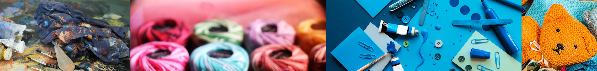

Step into the vibrant world of crafting and unlock the secrets of color with the enlightening article, “Discover the Art of Color: Expert Tips for Choosing the Perfect Colors in Crafting.” This captivating piece will guide you through the mesmerizing realm of color theory and provide you with expert tips on selecting harmonious color combinations that will elevate your crafting projects to new heights. Whether you are a seasoned crafter or just starting out on your creative journey, this article is a must-read for anyone looking to infuse their creations with an irresistible burst of color.

Understanding Color Theory
Color theory is the foundation of understanding how colors work together and the effect they have on our emotions and moods. By familiarizing yourself with color theory, you can make informed decisions when choosing colors for your crafting projects.
Primary, secondary, and tertiary colors
The color wheel is divided into three main categories: primary colors, secondary colors, and tertiary colors. Primary colors, which include red, blue, and yellow, are the base colors from which all other colors are created. Secondary colors, such as purple, green, and orange, are formed by mixing two primary colors. Tertiary colors are created by mixing a primary color with a secondary color.
Complementary and analogous colors
Complementary colors are pairs of colors that are located opposite each other on the color wheel, such as red and green or blue and orange. These colors create a vibrant contrast when used together. On the other hand, analogous colors are located next to each other on the color wheel, such as blue, green, and yellow. Using analogous colors creates a harmonious and unified color scheme.
Warm and cool colors
Colors can also be categorized as warm or cool. Warm colors like red, orange, and yellow evoke feelings of energy and warmth. They can create a sense of excitement and intensity in your crafting projects. Cool colors, such as blue, green, and purple, have a calming effect and can create a peaceful atmosphere. Understanding the different emotions associated with warm and cool colors can help you choose the right color palette for your craft.
Color harmonies
Color harmonies refer to the combination of colors that work well together. Some popular color harmonies include monochromatic, analogous, complementary, split-complementary, triadic, and tetradic color schemes. A monochromatic color scheme involves using different shades and tints of a single color. Analogous color schemes use colors that are next to each other on the color wheel. Complementary color schemes combine colors that are opposite each other on the color wheel. Split-complementary color schemes involve choosing a base color and combining it with the two colors adjacent to its complementary color. Triadic and tetradic color schemes involve using three or four colors that are evenly spaced on the color wheel.
Psychology of Color in Crafting
Colors have a significant impact on our emotions and can convey different messages or impressions. Understanding the psychology of color can help you choose colors that align with the desired mood or message of your crafting project.
Effects of different colors on mood and emotions
Different colors can evoke specific emotions and moods. For example, red is often associated with passion and energy, while blue represents calmness and tranquility. Yellow is commonly associated with happiness and positivity, while green symbolizes growth and nature. Understanding the emotional meanings associated with colors can help you create the desired atmosphere in your crafts.
Choosing colors based on the desired message or impression
When embarking on a crafting project, it’s essential to consider the message or impression you want to convey. If you are creating a piece of art to uplift and inspire, you might opt for bright and vibrant colors. On the other hand, if you want to create a soothing and serene environment, you might choose soft pastel shades. The colors you choose should align with the overall theme and purpose of your project.
Using color symbolism in crafts
Colors also have symbolic meanings that can add depth and significance to your crafts. For example, white often represents purity and innocence, making it suitable for wedding-related crafts. Black is associated with elegance and sophistication, while gold symbolizes luxury and wealth. By incorporating color symbolism into your crafts, you can enhance the overall meaning and impact of your work.

Considerations for Choosing Colors
When choosing colors for your crafting projects, several factors should be taken into consideration.
Purpose and theme of the project
The purpose and theme of your project will influence the colors you choose. For example, if you are creating a craft for a child’s birthday party, you might opt for bright and playful colors. On the other hand, if you are making a piece of home decor, you might consider more muted and sophisticated color palettes.
Audience and target market
Understanding your audience and target market is crucial when choosing colors. Different demographics may have different color preferences and associations. For example, children’s crafts might require vibrant and colorful designs, while a more mature audience may prefer subtle and elegant color choices.
Color preferences and personal style
Your personal color preferences and style should also play a role in your color selection. If you are drawn to earthy tones and natural hues, incorporating those colors into your crafts can help reflect your personal style. By choosing colors that you are naturally drawn to, you are more likely to feel a sense of satisfaction and enjoyment in your creative process.
Lighting conditions and environment
Consider the lighting conditions and environment in which your crafts will be displayed or used. Natural lighting can alter the appearance of colors, so it’s important to test your color choices under different lighting conditions. Additionally, if your crafts will be placed in a specific environment, such as a room with specific decor, consider how your color choices will complement or contrast with the surroundings.
Test Swatching and Color Mock-ups
Before committing to a specific color palette for your craft, it’s important to test different color combinations together. Swatching involves creating small samples of various colors and placing them next to each other to see how they interact. This allows you to assess the overall harmony and balance of the colors. Additionally, creating color mock-ups or prototypes of your craft can give you a better idea of how the colors will work in the final product.
Importance of testing colors together
Colors can appear different when viewed individually compared to when they are placed next to each other. Testing colors together allows you to see how they interact and whether they create the desired effect. It also helps you identify any colors that clash or create an unpleasant visual experience.
Creating color mock-ups or prototypes
Mock-ups or prototypes provide a tangible representation of your craft. By creating a mock-up using the chosen colors, you can visualize how the craft will look and make any necessary adjustments before finalizing the design. This step is particularly crucial for larger or more complex crafts where color placement and combination play a significant role.
Adjusting color combinations based on testing
Testing colors together and creating mock-ups enables you to make informed decisions about color combinations. If certain colors do not work well together or do not achieve the desired effect, you can make adjustments and experiment with alternative combinations. This iterative process ensures that you are satisfied with the final color choices for your craft.

Exploring Color Schemes
Color schemes provide a structure and guideline for combining colors in a harmonious and visually appealing way. There are several popular color schemes that you can explore for your crafting projects.
Monochromatic color scheme
A monochromatic color scheme involves using different shades, tints, and tones of a single color. This creates a cohesive and harmonious look. Monochromatic color schemes are often associated with simplicity and elegance.
Analogous color scheme
Analogous color schemes involve using colors that are adjacent to each other on the color wheel, such as blue, green, and yellow. This creates a harmonious and unified color palette. Analogous color schemes are often used when a seamless and soothing effect is desired.
Complementary color scheme
Complementary color schemes involve using colors that are opposite each other on the color wheel, such as red and green or blue and orange. This creates a vibrant and contrasting visual impact. Complementary color schemes are often used to create a dynamic and energetic atmosphere.
Split-complementary color scheme
A split-complementary color scheme involves choosing a base color and combining it with the two colors adjacent to its complementary color. This creates a balance between contrast and harmony. Split-complementary color schemes offer more versatility and variety compared to complementary color schemes.
Triadic color scheme
Triadic color schemes involve using three colors that are evenly spaced on the color wheel, such as red, yellow, and blue. This creates a balanced and visually appealing combination. Triadic color schemes offer a high level of contrast while still maintaining harmony.
Tetradic color scheme
Tetradic color schemes involve using four colors that are evenly spaced on the color wheel. This creates a vibrant and dynamic color combination. Tetradic color schemes allow for a wide range of color choices, offering ample opportunity for creativity.
Color Tips for Specific Crafts
Different crafts may have specific considerations when it comes to choosing colors. Here are some tips for selecting colors for various crafting projects:
Choosing colors for painting and drawing
When painting or drawing, consider the subject matter and desired mood of your artwork. For realistic portrayals, study the colors found in nature and use them as inspiration. Experiment with light and shadow to add depth to your artwork. When it comes to abstract art, feel free to be more adventurous and experimental with your color choices.
Selecting yarn and thread colors for knitting and crochet
When it comes to knitting and crochet, consider the purpose and recipient of your project. Soft and muted colors can create cozy and comforting items, while vibrant and bold colors can make a statement. Also, take into account the season and intended use of the knitted or crocheted item.
Picking fabric colors for sewing and quilting
The color choices for sewing and quilting largely depend on the project and personal preference. Consider the theme or purpose of your project. If you are creating a quilt for a baby, pastel shades and soft colors may be appropriate. For a more modern and bold project, consider using bright and contrasting colors.
Finding suitable colors for jewelry making
In jewelry making, colors play a vital role in complementing the materials used and creating a visually appealing design. Consider the type of jewelry you are making, whether it’s delicate and dainty or bold and statement-making. Take into account the color of the gemstones, beads, or metals you are using and choose colors that enhance their natural beauty.
Selecting colors for paper crafts and scrapbooking
Paper crafts and scrapbooking offer endless possibilities when it comes to color choices. Consider the theme, occasion, and mood of your project. Soft pastel colors are often used for baby-themed projects, while vibrant and bold colors can be used for celebratory occasions. Experiment with different color combinations to create eye-catching and visually interesting designs.

Creating Visual Balance
Visual balance is essential in crafting projects to create a pleasing and harmonious composition. Color plays a significant role in achieving visual balance.
Using color weight and intensity
Color weight refers to the visual prominence of a color. Colors with greater weight attract more attention, while lighter colors recede into the background. Consider the weight and intensity of each color you use to create a balanced composition.
Contrasting light and dark colors
Contrasting light and dark colors can add visual interest and depth to your crafts. By incorporating both light and dark shades, you create a balance that draws the eye and prevents the composition from feeling flat or one-dimensional.
Incorporating neutrals and muted tones
Neutrals and muted tones can act as a visual bridge between brighter and more intense colors. They provide a sense of calm and allow other colors to shine. Incorporating neutrals and muted tones creates balance and harmony within your crafts.
Balancing warm and cool colors
The balance between warm and cool colors can create a sense of equilibrium in your crafts. Warm colors can be visually intense and energetic, while cool colors offer a calming effect. By incorporating both warm and cool tones, you can strike a balance and create a visually interesting composition.
Understanding Color Application Techniques
In addition to choosing the right colors, understanding various color application techniques can enhance your crafting projects.
Color blocking and layering
Color blocking involves using solid blocks or sections of color in your crafts. This technique creates bold and defined areas of color. Layering, on the other hand, involves building up colors by applying multiple layers of translucent color. Both techniques add depth and visual interest to your crafts.
Gradations and ombre effects
Gradations involve smoothly transitioning from one color to another, creating a gradient effect. This technique is often used in painting or dyeing. Ombre effects, in particular, involve a gradual transition from dark to light or vice versa within a single color. Gradations and ombre effects add dimension and visual intrigue to your crafts.
Blending and shading techniques
Blending involves mixing colors together seamlessly to create a smooth transition between shades. This technique is often used in painting and drawing. Shading refers to the variation in color intensity to create depth and three-dimensionality. Blending and shading techniques can bring your crafts to life by adding depth and realism to your color applications.
Using color gradients and washes
Color gradients involve transitioning between multiple colors smoothly. It can create a stunning visual effect by seamlessly blending different hues. Washes refer to the application of a diluted color over a larger area. This technique is often used in watercolor painting. Both color gradients and washes offer versatility and allow you to create unique and captivating color applications.

Incorporating Trends and Personalization
While understanding color theory and techniques is essential, don’t be afraid to incorporate current color trends and add your own personal touch to your crafts.
Staying current with color trends
Color trends change over time, and staying current with these trends can keep your crafts fresh and modern. Research current color palettes and explore how you can incorporate them into your projects. However, remember that trends come and go, so it’s important to balance them with timeless color choices.
Personalizing crafts with unique color choices
Infusing your crafts with your own unique color choices can create a personal and distinct signature. Consider your personal style, preferences, and the message you want to convey through your crafts. By choosing colors that resonate with you, you can create one-of-a-kind pieces that reflect your individuality and creativity.
Using color to reflect individuality and creativity
Color has the power to express individuality and creativity. Crafting is a form of self-expression, and color choices play a significant role in conveying your unique style and personality. Don’t be afraid to experiment with unconventional color combinations or create unexpected color contrasts. Let your imagination guide your color choices and embrace the opportunities for creative expression.
Color Tools and Resources
Fortunately, there are various color tools and resources available to assist you in choosing the perfect colors for your crafting projects.
Color wheel and color harmony tools
Color wheels provide a visual representation of how colors are related to one another. They can help you identify complementary, analogous, and other color harmonies. Online color harmony tools can assist you in exploring different color combinations and finding harmonious palettes for your crafts.
Online color palette generators
Online color palette generators allow you to create custom color palettes based on your preferences. You can select different color schemes, adjust hues, and explore various shades and tints. These generators provide a convenient way to experiment with different color combinations and find the perfect palette for your crafts.
Color inspiration from nature and art
Nature and art are rich sources of color inspiration. Take time to observe the colors found in the natural world, from vibrant flowers to serene landscapes. Look at artwork and explore how artists have used color to create different moods and atmospheres. Drawing inspiration from nature and art can help expand your color palette and spark new creative ideas.
Using color swatch books and cards
Color swatch books and cards offer a tangible and reliable resource for choosing colors. They provide a wide range of color options and allow you to see how colors look when placed together. Having a physical color swatch book or card collection can be particularly helpful when you need to make quick color decisions or compare different shades and tones.
With these comprehensive tips and guidelines, you are now equipped with the knowledge and tools to confidently choose the perfect colors for your crafting projects. Whether you’re painting, knitting, sewing, or creating jewelry, understanding color theory, psychology, and application techniques will elevate your crafts to new levels of visual impact and artistic expression. Enjoy the art of color and let your creativity shine through every hue and shade you choose!