Unlock your creativity and elevate your crafting skills with the article “Master the Art of Color: Tips and Techniques for Crafting with Harmonious Color Combinations.” This captivating guide will take you on a journey through the world of color theory, providing valuable insights into selecting the perfect color combinations for your various craft projects. Whether you’re a beginner or an experienced crafter, this article will arm you with the knowledge and techniques to create stunning and harmonious works of art. Get ready to take your crafting skills to the next level as you dive into the colorful realm of artistic expression.


Understanding Color Theory
Primary, secondary, and tertiary colors
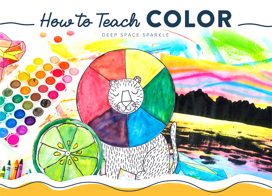
Color theory is the study of how colors interact and the principles behind creating harmonious color combinations. It is essential for any crafter to have a good understanding of the basics of color theory. The color wheel is the foundation of color theory, and it consists of twelve colors arranged in a circle. The three primary colors are red, blue, and yellow. These colors cannot be created by mixing other colors. By mixing the primary colors, we can create the secondary colors: orange, green, and purple. Tertiary colors are created by mixing a primary color with a secondary color, resulting in colors like red-orange and blue-green.
Warm and cool colors
Colors can also be categorized as warm or cool. Warm colors are those that visually evoke warmth and energy, such as red, orange, and yellow. They are often associated with fire and sun, and they can make a room feel cozy and inviting. Cool colors, on the other hand, are calming and soothing. Colors like blue, green, and purple are considered cool colors and are often associated with water and nature. Understanding the difference between warm and cool colors is crucial when selecting color combinations for your crafts.
Color wheel and color schemes
The color wheel is a visual tool that represents the relationships between colors. It can help crafters understand color harmonies and create pleasing color combinations. One popular color scheme is the monochromatic color scheme, which involves using different shades and tints of a single color. This creates a harmonious and cohesive look. Another color scheme is the analogous color scheme, which involves using colors that are next to each other on the color wheel. Analogous color schemes create a sense of harmony and are commonly used in nature-inspired crafts. Complementary color schemes, on the other hand, involve using colors that are opposite each other on the color wheel. This creates a high contrast and can bring a sense of vibrancy to your crafts. Split complementary and triadic color schemes are variations of the complementary scheme and offer additional options for creating dynamic color combinations.
The Psychology of Colors
Understanding color associations and symbolism
Colors have psychological and cultural associations that can affect how people perceive them. For example, red is often associated with passion and energy, while blue is associated with tranquility and trust. Understanding these associations can help you choose colors that convey the desired message or emotion in your crafts. Additionally, different cultures may perceive colors differently, so it’s important to consider the cultural context when selecting colors for your projects.
Using colors to evoke emotions
Colors have the power to evoke specific emotions in people. Warm colors like red, orange, and yellow can create a sense of excitement and enthusiasm. Cool colors like blue and green can evoke feelings of calmness and relaxation. By carefully selecting colors that align with the emotions you want to convey, you can create crafts that elicit specific emotional responses from viewers.
Creating the desired mood through color choices
Colors can also influence the mood of a space or a craft. Bright, bold colors can create an energetic and lively atmosphere, while soft pastel colors can create a more serene and peaceful mood. Dark colors often evoke a sense of elegance and formality. By considering the mood you want to establish, you can choose colors that support and enhance that mood in your crafts.

Color Harmony Techniques
Monochromatic color schemes
A monochromatic color scheme involves using different shades and tints of a single color. This creates a harmonious and cohesive look, as all the colors derive from the same base hue. Monochromatic color schemes can be visually calming and are often used in minimalist and contemporary crafts. By playing with the intensity of the color, you can create depth and dimension in your crafts.
Analogous color schemes
Analogous color schemes involve using colors that are adjacent to each other on the color wheel. This creates a harmonious and unified look, as the colors share similar undertones. Analogous color schemes are commonly found in nature and can evoke a sense of tranquility and balance. Crafting with analogous colors can create a sense of unity and coherence in your projects.
Complementary color schemes
Complementary color schemes involve using colors that are opposite each other on the color wheel. This creates a high contrast and can bring a sense of vibrancy and excitement to your crafts. Complementary colors intensify each other when placed in proximity, making them eye-catching and bold. When using complementary colors, it’s important to consider the balance between the colors to avoid overwhelming your craft.
Split complementary color schemes
A split complementary color scheme is a variation of the complementary scheme. Instead of using a single color’s direct complement, it uses the two colors adjacent to the complement. This creates a more subtle contrast while maintaining the vibrancy of the complementary scheme. Split complementary colors offer versatility in crafting, allowing for a unique and eye-catching color combination.
Triadic color schemes
A triadic color scheme involves using three colors that are evenly spaced around the color wheel. This creates a balanced and harmonious look, as the colors have an equal visual weight. Triadic color schemes offer a range of possibilities for experimentation and creativity in your crafts. By using colors that are equidistant from each other on the color wheel, you can create visually striking and dynamic combinations.
Using Color in Different Crafts
Color choices for painting and drawing
When it comes to painting and drawing, color choices play a critical role in expressing your vision and creating visually captivating artworks. Understanding color theory can help you select the right pigments and mix them to achieve the desired shades and tones. Whether you’re working with acrylics, watercolors, or oil paints, knowing how colors interact and complement each other can greatly enhance your painting and drawing skills.
Selecting colors for textile and fabric crafts
In textile and fabric crafts, such as sewing, quilting, and knitting, color choices can significantly impact the overall look and feel of the finished piece. Each fabric choice presents an opportunity to showcase your creativity and artistic flair. By understanding color theory, you can select harmonious colors that complement each other and bring your textile crafts to life. Consider the color combinations that reflect the intended mood or theme of your project, whether it’s a cozy quilt or a vibrant piece of clothing.
Color combinations for paper crafts
Paper crafts, including scrapbooking, card making, and origami, offer endless possibilities for color exploration. The colors you choose can set the tone for the occasion or theme you want to convey. From bright and playful colors for children’s birthday cards to elegant and muted tones for wedding invitations, color selection plays a crucial role in paper crafts. By using color theory techniques, like complementary or analogous color schemes, you can create visually appealing and cohesive paper crafts.
Choosing colors for jewelry making
In jewelry making, color choices can greatly impact the overall aesthetic and appeal of the piece. Whether you’re designing necklaces, earrings, or bracelets, understanding color theory allows you to select gemstones, beads, and metals that complement each other harmoniously. Consider the symbolism and associations of different colors to express and enhance the jewelry’s intended message or purpose. The right color combinations can elevate your jewelry designs to new levels of sophistication and artistry.
Color considerations in pottery and ceramics
Pottery and ceramics offer a unique opportunity to experiment with color and texture. When crafting clay objects, the choice of glazes and surface treatments greatly affects the final appearance. Understanding color theory helps potters and ceramic artists select glazes and underglazes that complement their designs and enhance the three-dimensional forms. Whether aiming for bold and vibrant pieces or subtle and earthy tones, color choices play a key role in the final fired results.

Factors to Consider in Color Combinations
Contrast and balance
Contrast is a crucial element of effective color combinations. By using colors that are different from each other in terms of value, saturation, or hue, you can create visual interest and make certain elements stand out. On the other hand, achieving balance in your color combinations is equally important. Balance ensures that no single color overwhelms or distracts from the overall composition. Consider the visual weight of different colors and their placement to achieve a harmonious balance in your crafts.
Tonal value and proportion
Tonal value refers to the lightness or darkness of a color. By considering tonal values in your color combinations, you can create depth and dimension in your crafts. Proportion is also a crucial factor to consider when working with color. Balancing the proportions of different colors can create a sense of harmony and prevent any one color from dominating the composition. Through careful consideration of tonal value and proportion, you can achieve visually pleasing color combinations.
Light and color interactions
Lighting conditions can have a significant impact on how colors appear. Natural and artificial lighting can alter the perception of hue, saturation, and contrast. When selecting color combinations for your crafts, it’s important to consider the lighting conditions in which the finished piece will be viewed. Test your color choices under different lighting conditions to ensure they achieve the desired effect.
Color placement and emphasis
The way colors are placed within a craft can influence the overall composition and impact of the colors. Consider using colors strategically to create focal points or guide the viewer’s eye through your craft. The placement of dominant or contrasting colors can add visual interest and create a dynamic composition. By understanding color theory principles, you can use color placement to enhance the impact and storytelling of your crafts.
Exploring Color Mixing Techniques
Primary color mixing
Primary color mixing involves combining the primary colors (red, blue, and yellow) to create all other colors. By experimenting with different ratios and mixing techniques, you can achieve a wide range of hues and shades. Understanding primary color mixing is foundational to color theory and allows you to have greater control over the colors you use in your crafts.
Secondary and tertiary color mixing
Secondary colors are created by mixing two primary colors together. For example, mixing red and blue creates purple. Similarly, tertiary colors are created by mixing a primary color with a secondary color. By exploring secondary and tertiary color mixing, you can expand your color palette and create unique and personalized shades that suit your crafts perfectly.
Creating different shades, tints, and tones
Shades, tints, and tones refer to variations of a hue achieved by adding black, white, or gray, respectively. By adjusting the value of a color, you can create depth and dimension in your crafts. Shades are darker versions of a color, tints are lighter versions, and tones are achieved by desaturating a color. Understanding how to create shades, tints, and tones allows you to add richness and complexity to your color combinations.
The impact of color mixing on color harmony
Color mixing techniques can greatly impact the harmony of your color combinations. By understanding how colors interact and blend, you can achieve a cohesive and balanced look in your crafts. Experiment with different color mixing techniques to find combinations that resonate with your artistic vision. Color mixing opens up a world of possibilities for creating unique and harmonious color combinations in your crafts.

Tips for Selecting Harmonious Color Combinations
Start with a base color
When selecting color combinations, it can be helpful to start with a base color. This can be a color that inspires you or serves as a foundation for your project. Once you have your base color, you can use color theory principles to select complementary or analogous colors that harmonize with it. Starting with a base color provides a starting point and helps narrow down the color options.
Consider the color temperature
Color temperature refers to how warm or cool a color appears. When selecting color combinations, consider the color temperature and how it aligns with the mood or theme of your craft. Warm colors can create a sense of energy and vibrancy, while cool colors evoke a calming and soothing atmosphere. By considering color temperature, you can create color combinations that support the intended mood or message of your crafts.
Experiment with different color schemes
Color schemes offer a structured approach to selecting colors. While it’s important to have a basic understanding of color theory, don’t be afraid to experiment and think outside the box. Play with different color schemes, such as triadic or split complementary, to create unexpected and intriguing color combinations. Allow yourself the freedom to explore and discover unique harmonious combinations.
Use color theory as a guide
Color theory provides a solid foundation for understanding color relationships and creating harmonious combinations. While experimentation is encouraged, using color theory as a guide can help inform your decisions. Consider the principles of color harmony, such as complementary or analogous colors, when selecting color combinations. This will ensure that your crafts have a visually pleasing and cohesive look.
Take inspiration from nature and art
Nature and art are abundant sources of inspiration when it comes to color combinations. The natural world is filled with beautiful color harmonies, from vibrant sunsets to serene ocean waves. Look to these natural color combinations for guidance and inspiration. Similarly, study the color palettes used in art, whether it’s paintings, illustrations, or photography. Artists have a keen eye for combining colors in captivating ways, and you can learn a lot from their work.
Consider the intended use and audience
When selecting color combinations, it’s important to consider the intended use and audience of your crafts. Different colors evoke different emotions and have varying cultural associations. For example, vibrant and bold colors may appeal to children, while more muted and sophisticated colors may be better suited for a formal event. By considering the preferences and expectations of your target audience, you can create crafts that resonate with them and evoke the desired response.
Using Color Tools and Resources
Color wheels and color palettes
Color wheels provide a visual representation of color relationships and can be a helpful tool when selecting color combinations. They allow you to see how different colors interact and complement each other. Color palettes, on the other hand, are preselected sets of colors that work well together. They can be found in various forms, such as printed guides or online resources. Color wheels and color palettes are valuable aids in crafting with harmonious color combinations.
Online color scheme generators
In today’s digital age, there are numerous online resources available to help with color selection. Online color scheme generators allow you to explore different color schemes and combinations with just a few clicks. These tools often provide options to adjust color palettes based on hue, saturation, and brightness. By using online color scheme generators, you can quickly and easily experiment with different color combinations for your crafts.
Color theory books and references
For a more in-depth exploration of color theory, consider referring to color theory books and references. These resources provide valuable insights into the principles behind color theory and offer practical examples and exercises to enhance your understanding. Color theory books can serve as a comprehensive guide and a source of inspiration for selecting harmonious color combinations in your crafts.
Color apps and digital resources
In addition to online color scheme generators, there are various color apps and digital resources available. These tools often provide features like color swatches, color matching, and color exploration. With just a few taps on your smartphone or tablet, you can access a wide range of colors and experiment with different combinations. Color apps and digital resources are convenient and accessible tools for crafting with harmonious color combinations on the go.

Applying Color Theory Principles to Your Crafts
Creating a color scheme mood board
A color scheme mood board is a visual representation of the colors you plan to use in your craft. It can include swatches, images, and other visual elements that capture the essence of your color scheme. Creating a mood board can help you visualize how the colors work together and ensure that they convey the desired mood or theme. It’s a helpful tool during the planning stage and can serve as a reference throughout your craft.
Testing color combinations
Before committing to a specific color combination, it’s a good idea to test it out. This can involve creating small samples or sketches with the chosen colors. Testing color combinations allows you to see how they interact and how different lighting conditions might affect their appearance. By experimenting with the colors, you can make informed decisions and ensure that the final result aligns with your artistic vision.
Maintaining color harmony throughout the project
As you work on your craft, it’s essential to maintain color harmony throughout the entire project. Consider how the colors interact with each other at each step of the process. Make adjustments as needed to ensure that the colors work together harmoniously. This may involve fine-tuning the proportions of different colors, adjusting the placement of certain elements, or incorporating additional colors to enhance the overall composition.
Making adjustments and tweaks to achieve desired results
Crafting is a dynamic and iterative process, and it’s natural to make adjustments and tweaks along the way. If you’re not completely satisfied with a particular color combination, don’t be afraid to make changes. Trust your instincts and explore different possibilities. Sometimes a small tweak can make a significant difference in the overall impact of your craft. Be open to experimentation and adaptable to achieve the desired results.
Avoiding Common Color Mistakes
Using too many colors
One common mistake is using too many colors in a single craft. When there are too many colors, the overall composition can appear busy and overwhelming. Instead, focus on selecting a cohesive color palette with a limited number of colors. This will create a more visually pleasing and harmonious result.
Ignoring color proportions
Proportions play a crucial role in color combinations. When one color dominates the composition, it can overpower other colors and disrupt the overall balance. Pay attention to the proportions of different colors and ensure that they work together harmoniously. Adjust the size and placement of different color elements to achieve a balanced and visually appealing result.
Neglecting the impact of lighting
Lighting can significantly impact how colors appear. Neglecting to consider the lighting conditions in which your craft will be viewed can lead to unexpected color shifts. Test your color combinations under different lighting conditions to ensure they achieve the desired effect. This will help you anticipate any potential color variations and make appropriate adjustments.
Overlooking color symbolism
Colors have symbolic meanings and associations that can influence how people perceive them. When selecting colors for your crafts, consider the cultural and emotional connotations associated with different colors. Be mindful of the message or mood you want to convey and choose colors that align with those intentions. By overlooking color symbolism, you risk sending unintended messages through your crafts.
By mastering the art of color and understanding color theory, you can unlock a world of possibilities in your crafting. Whether you’re painting, sewing, or creating jewelry, color choices play a vital role in creating visually captivating and harmonious crafts. By exploring different color combinations, experimenting with color mixing techniques, and considering the principles of color theory, you can elevate your crafts to new levels of artistic expression. So, embrace the power of color, let your imagination soar, and create crafts that delight and inspire!