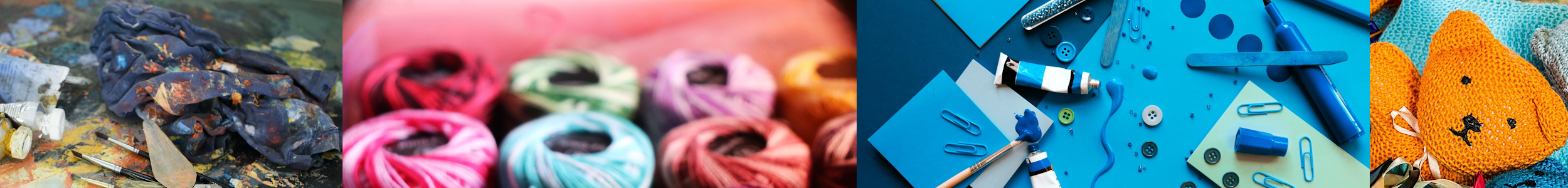
Discover the secrets of unleashing your inner artist with “The Ultimate Guide to Crafting with Color.” This comprehensive guide takes you on a colorful journey, exploring the world of crafting in harmony with the vibrant hues around you. Dive into the art of color theory and learn how to master the selection of color combinations that will bring your crafts to life. Whether you’re a seasoned creator or just beginning your artistic journey, this guide is your go-to resource for unlocking the potential of color in your crafts. Get ready to paint your world in a kaleidoscope of creativity!
Chapter 1: Understanding Color Theory


1.1 Basic color terminology
Understanding basic color terminology is essential to grasp the fundamentals of color theory. Colors can be described in various ways, including hue, value, and saturation.
- Hue: Hue refers to the basic color itself, such as red, blue, or yellow.
- Value: Value refers to the lightness or darkness of a color. A lighter value indicates more white added to the color, while a darker value contains more black.
- Saturation: Saturation, also known as intensity or chroma, refers to the purity or vibrancy of a color. A highly saturated color is vivid, while a desaturated color appears muted or grayish.
1.2 Primary, secondary, and tertiary colors
Colors are classified into different categories based on their relationships with each other. Primary colors, including red, blue, and yellow, are the foundation for all other colors. Secondary colors are created by mixing equal amounts of two primary colors, such as green (a mix of yellow and blue), orange (a mix of red and yellow), and purple (a mix of red and blue). Tertiary colors are achieved by mixing a primary color with a neighboring secondary color.
1.3 The color wheel and its importance
The color wheel is a visual representation of the relationships between colors. It consists of twelve colors arranged in a circular format. The placement of colors on the wheel helps us understand their harmonious interactions. The primary colors sit equidistant from each other, forming a triangle, while the secondary colors are placed between the primary colors they are created from. Tertiary colors complete the wheel, forming six small triangles. Understanding the color wheel’s structure is crucial when selecting color combinations that work well together.
1.4 Warm and cool colors
Warm and cool colors are two categories of colors that evoke different emotional responses and create different visual effects. Warm colors, such as red, orange, and yellow, tend to be associated with energy, passion, and brightness. On the other hand, cool colors like blue, green, and purple create a calming and soothing effect. The choice of warm or cool colors can greatly impact the overall mood of a craft or artwork.
1.5 Complementary and contrasting colors
Complementary colors are pairs of colors that sit opposite each other on the color wheel, creating a vibrant contrast when placed together. For example, red and green, blue and orange, and yellow and purple are complementary color pairs. Combining complementary colors can add visual interest and make elements stand out. Contrasting colors, on the other hand, involve selecting colors that are different in hue, value, or saturation, creating a strong visual impact. Experimenting with the use of complementary and contrasting colors can result in striking and dynamic crafts.
1.6 Analogous and monochromatic colors
Analogous colors are groups of colors that sit next to each other on the color wheel. They share similar undertones and create a harmonious and cohesive color scheme. For instance, yellow, yellow-green, and green form an analogous color scheme. Monochromatic color schemes, on the other hand, involve using different shades, tints, and tones of a single color. These schemes can create a sense of unity and simplicity in a craft or artwork. Exploring analogous and monochromatic color schemes allows for the creation of cohesive and visually appealing crafts.
Chapter 2: Exploring Color Psychology
2.1 The emotional impact of colors
Colors have a significant impact on our emotions and can evoke specific feelings or moods. Understanding the emotional associations of different colors is crucial in crafting, as it can help convey the desired message or atmosphere. For example, red may evoke excitement and passion, while blue may create a sense of calmness and tranquility.
2.2 Using colors to evoke specific moods
Crafters can strategically use colors to elicit specific emotions or moods in their artwork. For instance, using warm colors like red and orange can create a sense of energy and enthusiasm, making them suitable for vibrant and lively crafts. Conversely, cool colors like blue and green can evoke a peaceful and serene ambiance, making them ideal for tranquil and soothing crafts.
2.3 Understanding cultural associations with colors
Colors can also carry cultural meanings and associations. It is essential to consider the cultural context when selecting colors for crafts, as different cultures may interpret colors differently. For example, white symbolizes purity and innocence in Western cultures, while it signifies mourning in certain Eastern cultures.

2.4 Incorporating color psychology in your crafts
By understanding the psychological impact of colors, crafters can strategically utilize colors to convey specific messages or evoke desired emotions in their artwork. Whether it’s using vibrant hues to create energy or soothing shades to induce calmness, incorporating color psychology can elevate the overall impact of a craft.
Chapter 3: Selecting Color Combinations
3.1 Harmonious color schemes
Creating harmonious color schemes involves selecting colors that work well together and create a visually pleasing effect. This can be achieved through various methods, including complementary colors, analogous colors, or monochromatic colors. Experimenting with different color combinations can help crafters find harmonious palettes that enhance their artwork.
3.2 Using color tools and resources
To aid in the selection of color combinations, crafters can utilize various color tools and resources. These tools can include color palette generators, color harmony guides, or color combination books. Online platforms and smartphone apps also provide a plethora of color selection resources, making it easier than ever to find the perfect color combinations for crafts.
3.3 Creating balanced palettes
Crafters must consider balance when selecting color palettes. Balancing colors involves ensuring that no single color dominates the overall composition. This can be achieved by incorporating various tones, shades, and intensities within the chosen color scheme. A well-balanced color palette can create a harmonious and visually appealing composition.
3.4 Experimenting with unconventional color pairings
Crafters can also explore unconventional color pairings to create unique and eye-catching effects in their crafts. By stepping outside traditional color combinations, crafters can push their creativity and discover exciting color palettes that captivate the viewer. Experimentation with unconventional color pairings can lead to refreshing and innovative artistic breakthroughs.
Chapter 4: Color Techniques in Different Crafts
4.1 Painting with color
Painting with color opens up a wide array of techniques and possibilities for artists and crafters. Different painting mediums, such as watercolors, acrylics, and oils, offer unique methods of manipulating and applying color.
4.1.1 Watercolor techniques
Watercolor techniques involve the use of water-soluble pigments, creating translucent and delicate effects. Techniques such as wet-on-wet, dry brushing, and glazing allow artists to achieve various textures and visual effects with color.
4.1.2 Acrylic painting techniques
Acrylic painting techniques offer versatility and vibrant color possibilities. Artists can explore techniques such as layering, impasto, and glazing to create texture, depth, and dimension in their artworks.
4.1.3 Oil painting techniques
Oil painting techniques provide rich and luscious color results. Techniques like alla prima, glazing, and scumbling allow artists to manipulate the viscosity and drying time of the paint, resulting in smooth blends and realistic effects.

4.2 Color in drawing and sketching
While drawing typically involves black and white, incorporating color can bring a new dimension to sketches and illustrations. Artists can use colored pencils, markers, or pastels to add vibrant hues to their drawings, enhancing the overall visual impact.
4.3 Color in mixed media art
Mixed media art offers limitless possibilities for combining colors and textures. Artists can incorporate various materials and techniques, such as collage, painting, and printmaking, to create layered and visually dynamic artworks.
4.4 Color in textile and fabric crafts
Textile and fabric crafts, such as sewing, quilting, and embroidery, allow artists to explore color through different materials and techniques. From selecting fabric colors to thread choices, crafters can create visually stunning and unique textile pieces.
4.5 Color in paper crafts
Paper crafts, including origami, scrapbooking, and card-making, present opportunities to incorporate color through patterned papers, paints, and embellishments. By selecting and combining colorful elements, crafters can create visually appealing paper creations.
4.6 Color in jewelry making
Jewelry making involves selecting beads, gemstones, and metals in various colors to create wearable art pieces. Combining different colors and textures in jewelry design allows crafters to express their creativity and style.
4.7 Color in pottery and ceramics
Pottery and ceramics provide artists with the opportunity to explore color through glazes and pigments. Artists can experiment with color blending, layering, and application techniques to achieve unique and expressive ceramic artworks.
Chapter 5: Enhancing Your Craft with Color
5.1 Understanding color value and contrast
Color value refers to the lightness or darkness of a color. By understanding color value, crafters can create contrast in their artwork. Contrasting light and dark values can add depth, dimension, and visual interest to a craft.
5.2 Using color to create depth and dimension
Color can be used strategically to create the illusion of depth and dimension in a two-dimensional craft. By incorporating techniques such as shading, highlighting, and color gradients, crafters can make their artwork appear three-dimensional and lifelike.
5.3 Playing with color saturation and intensity
Saturation and intensity refer to the vibrancy and purity of a color. By playing with color saturation and intensity, crafters can evoke different emotions and create visual impact in their artwork. Using highly saturated colors can create a bold and energetic effect, while desaturated colors can evoke a more subtle and calming ambiance.

5.4 Adding color accents and highlights
Crafters can enhance their artwork by strategically adding color accents and highlights. By selecting specific areas or elements to emphasize with vibrant or contrasting colors, these accents can create focal points and draw the viewer’s attention.
5.5 Incorporating color through textures and patterns
Textures and patterns can add depth and interest to crafts. By incorporating color through different textures and patterns, crafters can create visual complexity and richness in their artwork. Whether it’s through brush strokes, fabric patterns, or surface treatments, colors can be used to enhance the tactile experience of a craft.
Chapter 6: Overcoming Color Challenges
6.1 Dealing with color overwhelm
Choosing colors for a craft can sometimes feel overwhelming due to the vast possibilities. To overcome color overwhelm, crafters can start by selecting a focal color or theme and gradually build their color palette around it. Breaking color choices into smaller decisions can make the process more manageable.
6.2 Troubleshooting color mixing and blending
Color mixing and blending can be challenging, especially for beginners. Crafters can improve their color mixing skills by practicing with limited color palettes and gradually experimenting with more complex combinations. Patience, observation, and understanding color theory principles can help troubleshoot any issues with color mixing and blending.
6.3 Adjusting color choices on the go
Crafters may find that colors they initially selected do not work as expected once applied to their craft. In such situations, it is essential to be adaptable and open to modifying color choices on the go. Making adjustments, such as adding or subtracting colors, can result in improved visual harmony and cohesiveness.
6.4 Working with limited color supplies
Limited color supplies should not hinder creativity. Instead, they can fuel artistic innovation and resourcefulness. Crafters can experiment with mixing primary colors to create a broader range of hues or focus on creating monochromatic or analogous color schemes with the available supplies.
6.5 Fixing color mistakes and bloopers
Mistakes happen, and color mishaps are no exception. When faced with color mistakes, crafters can explore creative solutions, such as blending, layering, or adding embellishments, to salvage or enhance the overall artwork. Embracing accidents and turning them into opportunities for artistic expression can lead to unexpected and intriguing outcomes.
Chapter 7: Color in Different Art Styles
7.1 Bold and vibrant color in pop art
Pop art is known for its bold and vibrant color palettes. Artists can experiment with combining bright and contrasting colors to create visually impactful pop art pieces. The use of strong colors can heighten the sense of energy and dynamism in pop art.
7.2 Soft and pastel color in impressionism
Impressionism often features soft, muted, and pastel color palettes. Artists can blend delicate and harmonious colors to evoke a sense of light, atmosphere, and tranquility in their impressionist artworks. Subtle color variations and gentle brushwork contribute to the overall impressionistic style.

7.3 Earthy and natural color in realism
Realism aims for accurate representation, often utilizing earthy and natural color palettes. Realist artists can pay great attention to color choice and precise color mixing to recreate lifelike and detailed artwork. The emphasis is on capturing the subtle hues and tones found in nature and everyday life.
7.4 Minimalist color in abstract art
Abstract art allows artists to break free from realistic representation and explore color as the main focus. Minimalist color schemes, such as black and white or limited palettes, can be used to convey emotions, ideas, and concepts in abstract art. The absence of a wide range of colors emphasizes the importance of the selected hues.
7.5 Bright and neon color in street art
Street art often features vibrant and eye-catching color combinations. Artists can incorporate bright and neon colors to create visually striking murals and graffiti. The bold use of color in street art can convey messages and capture attention in urban environments.
Chapter 8: Creating Your Own Color Palette
8.1 Finding inspiration for unique color schemes
Crafters can find inspiration for unique color schemes everywhere, from nature to art exhibitions to everyday objects. By observing the colors around them, crafters can develop their personal color preferences and gather ideas for their own distinctive palettes.
8.2 Building a personal color swatch
Creating a personal color swatch can help crafters visualize and organize their preferred color combinations. This can be done by cutting out color samples from magazines or printing color references from online sources. A personal color swatch serves as a handy resource for selecting colors for future crafts.
8.3 Documenting and organizing your color choices
Crafters can document and organize their color choices by keeping a color journal or digital folder. This allows for easy reference and helps track color combinations that have worked well in the past. Organizing color choices can streamline the creative process and make it easier to achieve desired results.
8.4 Experimenting with custom color blends
Crafters can experiment with custom color blends by mixing and layering paints or other color mediums. By creating unique blends, crafters can achieve colors that are tailored to their specific needs and artistic vision. Custom color blends allow for greater individuality and creative expression in crafts.
Chapter 9: Tools and Materials for Colorful Crafting
9.1 Essential color mediums and supplies
In order to explore color in crafting, certain essential color mediums and supplies are necessary. These can include paints, markers, colored pencils, pastels, and inks. Crafters should select quality color mediums that suit their preferred techniques and desired results.
9.2 Quality brushes, markers, and pencils
Using quality brushes, markers, and pencils can greatly enhance the application and control of color in crafts. Crafters should invest in brushes with various bristle types and sizes, markers with vibrant and long-lasting ink, and colored pencils with good color laydown.
9.3 Color mixing palettes and trays
Color mixing palettes and trays are essential tools for manipulating and blending colors. From traditional palettes made of ceramic or plastic to disposable palette paper, crafters have various options depending on their preferences. The choice of a suitable palette or tray can greatly facilitate the color mixing process.
9.4 Color charts and reference guides
Color charts and reference guides provide valuable information on color combinations, pigments, and techniques. Crafters can utilize color charts to explore different color relationships and discover new possibilities. Reference guides also offer tips and tricks for achieving specific effects and mastering color application.
9.5 Specialty tools for advanced color techniques
For those exploring advanced color techniques, specialty tools can be beneficial. These can include airbrushes, palette knives, sponges, and masking materials. Crafters should consider investing in these tools as they expand their skills and artistic range.
Chapter 10: Showcasing Your Colorful Art
10.1 Displaying and framing your artwork
Displaying and framing artwork showcases the craftsmanship and enhances the impact of color in a craft. Crafters should consider suitable frames, mats, and mounting techniques that complement the colors and style of their artwork. Proper display and framing can transform a craft into a stunning piece of art.
10.2 Photography tips for capturing vibrant colors
Photographing colorful crafts presents its own set of challenges. Crafters can follow certain photography tips to accurately capture the vibrant colors of their artwork. These include using natural lighting, adjusting white balance, and experimenting with different angles and compositions to showcase the colors effectively.
10.3 Sharing your creations on social media
Social media platforms provide crafters with an excellent opportunity to share their colorful creations with a wider audience. By utilizing visually appealing photographs and engaging captions, crafters can showcase their artwork, connect with fellow artists and enthusiasts, and gain recognition for their vibrant crafts.
10.4 Participating in art exhibitions and craft fairs
Art exhibitions and craft fairs offer crafters a chance to display and sell their colorful creations in a physical setting. Participating in such events can provide valuable exposure, feedback, and networking opportunities. Crafters should research and select events that align with their style and audience.
10.5 Preserving and protecting your colorful crafts
To ensure the longevity and vibrancy of their crafts, crafters should take measures to preserve and protect them. This can involve using archival-quality materials, UV-resistant coatings, and appropriate storage techniques. Preserving and protecting colorful crafts allows them to be enjoyed and appreciated for years to come.
By exploring the various aspects of color theory, incorporating color psychology in crafting, selecting harmonious color combinations, learning color techniques in different crafts, enhancing crafts with color, overcoming color challenges, exploring color in different art styles, creating personal color palettes, and understanding the tools and materials for colorful crafting, crafters can unleash their inner artist and create vibrant and visually captivating crafts. The journey of crafting with color is an ongoing adventure, allowing crafters to continually learn, grow, and express their creativity through the powerful language of color.